Joanna Kinnersly-Taylor is a printed textile artist and designer based in Glasgow. The current scope of her practice embraces often large-scale, site-specific commissions for both public and private interiors, one-off works for galleries, and functional domestic linens.
There is a theme of memory and the home running through much of her work and the everyday or commonplace is often a starting point. Images have their context altered through being magnified, manipulated or abstracted, and are translated onto linen and wool through screen-printing in a series of layers to create new intimate ‘landscapes’.
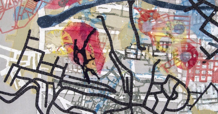
After a couple of years away from the studio following the birth of her daughter, Joanna’s first project was a new tea towel design Alphabet. In 2016, she will be showing new work as part of her ongoing Perpetual Mapping series, in one of the gallery spaces at the inaugural Knitting and Stitching Show in Edinburgh and in Making Space at The Silk Museum, Macclesfield with the 62 Group of Textile Artists.
Joanna runs courses from her studio throughout the year and also offers one-to-one tuition. She is the author of Dyeing and Screen-Printing on Textiles .
In this interview, which is part of our From conception to creation series, Joanna discusses The Shape of Things. Beginning with a journey into the past to find inspiration, Joanna discovered an emotional connection to the present. Here, she brings us full circle as we follow her creative journey in making this deeply personal piece.
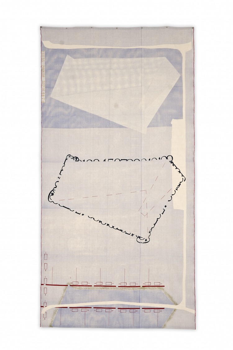
Name of piece: The Shape of Things
Year of piece: 2009
Size of piece: 133cm wide x 260cm high
Materials used: Irish linen
Techniques used: Screen-printing
Name of accompanying journal: Mapping The Shape of Things
Year of journal: 2009
Size of journal: 168cm wide x 89cm high
Materials used: Various papers, thread
Techniques used: Printed, stitched and collaged
TextileArtist.org: How did the idea for the piece come about? What was your inspiration?
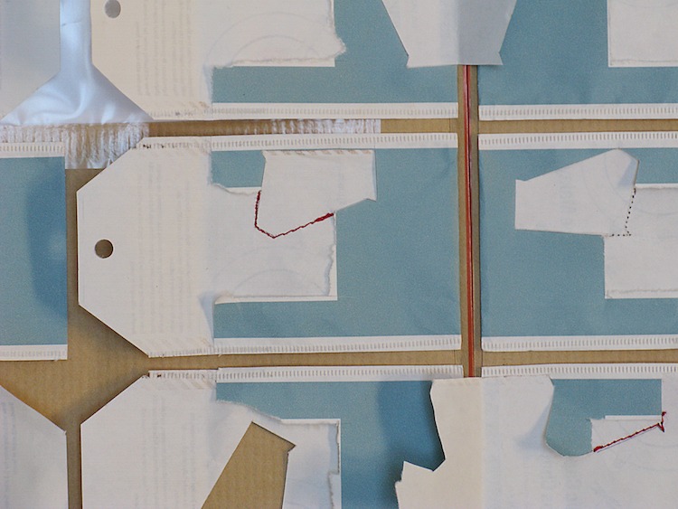
Joanna Kinnersly-Taylor: The Shape of Things is not a particularly recent work, being completed in 2009, yet I have chosen it because it has proved to be one of those ‘turning point’ pieces within my practice. As with all work, it came into being as a result of a rigorous and searching creative process; The Shape of Things, however, comes with formal evidence of this in the form of a paper ‘map’, details of which can be found above alongside textile artwork.
The project came about when I worked at Glasgow School of Art. Staff in the Department of Fashion and Textiles were asked to respond to material held in the Archives and Collections Centre at the School to create work for an exhibition, Awaken. From the wide range of artefacts available, I chose a travel diary created by Jack Lindsay, an interior design student who won a travel bursary in 1950.
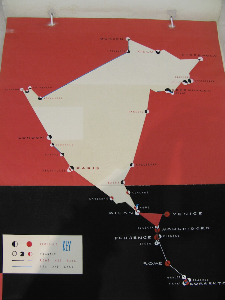
He recorded his adventures through writing, drawing and painting with a meticulousness and strong graphic style that I admired. Travelling by train through Europe, he collated all kinds of information in an arresting manner, providing a visually rich and informative document for the viewer.
The themes of journey and place echoed some of my own areas of interest; making The Shape of Things coincided with my father’s illness and subsequent death and unexpectedly, it became a sort of tribute to him.
What research did you do before you started to make?
Two summers before this project began, I purchased a vintage map of the south east of England because I liked the reverse: a grid of brown linen tape with repairs in red and blue, forming a striking Mondrian-type composition. It had been pinned to my studio wall since then, waiting for the right moment and I was not conscious of it when I chose to work from Jack Lindsay’s travel diary and the map featured on page 1 of his book.
There were also other areas of interest from the archive that I documented and these can be broadly categorised as follows: notebooks and graphics (hand-written, diagrammatic); labelling and storing (brown or linen labels, cotton tape, acid-free tissue, brown paper, archive boxes); textiles (composition and structure, especially grids, and lettering).
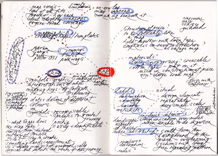
Using the labours of another to generate new work
After this initial visit to the archive with my camera, I started making mental connections and then mapping out my thoughts in order to untangle the various strands to get some clarity and shape.
The way Jack Lindsay had plotted his route resulted in an abstract shape that was not obviously recognisable geographically. It seemed to give me the licence to go on my own journey, allowing me the opportunity to bring several important elements together in a new train of thought.
Jack’s diary was, for me, simply a most inspiring object – beautifully presented in every way. It was not something I sought to emulate or re-interpret visually, rather it acted as a catalyst that enabled me to take some new ideas forward in a particular way. I felt an understanding with his mode of thought and were he here, I hoped he might have empathised with my response.
I certainly have a sense of humility in using the labours of another to generate new work, so felt extra vigilant in evolving my own voice and language. It is always very important to me that my starting points come from within myself and my experience of the world, but I will then move these initial thoughts on, allowing them to evolve and find their own identity so that I hope the work may evoke a sense of recognition with the viewer.
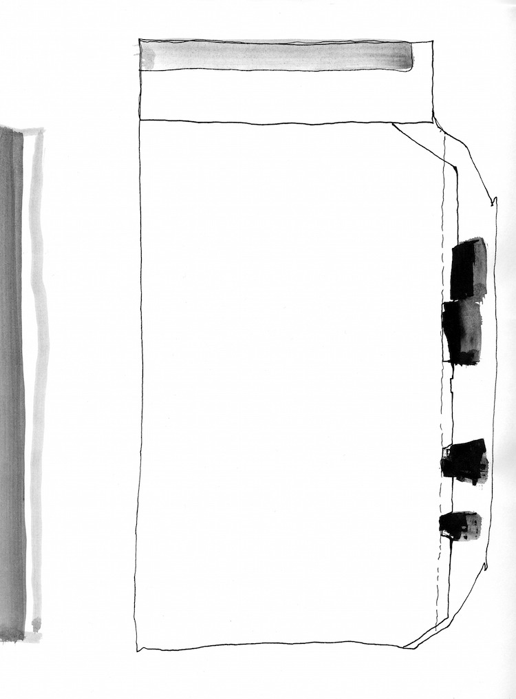
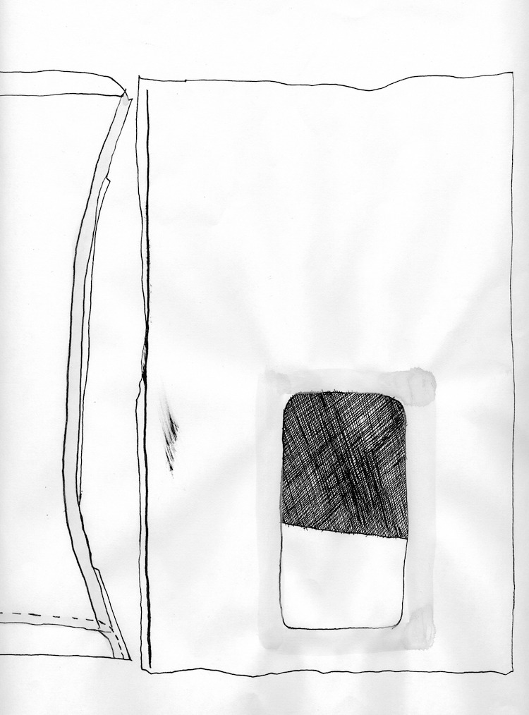
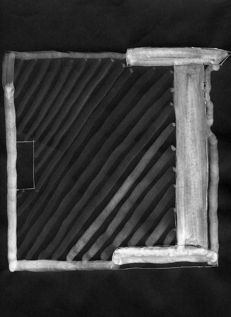
Creative process journal
A key part of the project was to document the development of the work through a ‘creative process journal’. This formal analysis and presentation of what is usually quite a private journey proved to be a personally illuminating process, the resulting document not only an accompaniment but also a work in its own right.
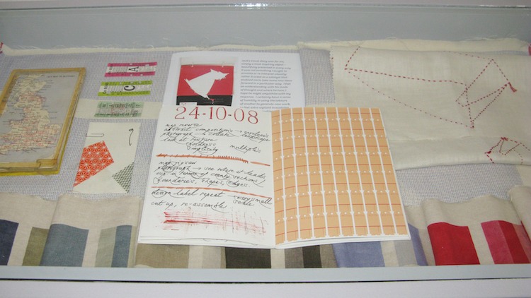
In generating the ‘creative process journal’ (CPJ), we were also required to use a logbook. All this sounds terribly formal, and in its way, I suppose it was, yet I found the structure strangely energising. There is so much to work out when generating ideas and a ‘system’ can help to focus, define and shape complex thoughts.
I found the ‘magpie’ nature of the logbook liberating, in that the bringing together of what at first may seem like unrelated elements in a fairly random way was ‘permissible’. Information gathered into the logbook included a passage from a novel I was reading at the time, Evidence of Things Unseen by Marianne Wiggins, describing the route of the Tennessee river; drawings of sections of ships by I K Brunel and extracts from Leeds Pottery pattern books, both selected for their ‘overlapping’ qualities; Air Mail and See Britain by Train posters by Abram Games; photographs of an Industrial Life of England and Wales 1950’s Victory jigsaw puzzle and a sew your own route postcard map complete with needle and thread.
All these things reinforced the feeling of resonance one experiences through a seemingly disparate range of encounters, when fully ‘awakened’ and engaged in one’s practice. In the end, of course, none of these items might be utilised, yet they have probably entered into the subconscious and may have subtle influence, permeating into other elements.
Keeping clear of preconceived ideas
The ‘plotted’ route is one of the key conceptual aspects to this work and I needed to decide what criteria to adopt in order to generate this piece of visual information. I started by linking significant places and journeys on a map of Great Britain, resulting in many overlapping forms. This had the potential for a series of pieces, but felt too complex to use in conjunction with other desired elements.
At the beginning of this phase of work, I was not at all conscious of bringing something of my father’s life into the piece. Yet, as the investigation developed, I realised that aspects relating to him were seeping in, albeit in a very abstract way. I plotted all the places where he had lived, resulting in a simple shape that could be used in a variety of ways. Having arrived at this shape, it did not feel important for it to be overtly representational, only that it was derived from something real, not arbitrary.
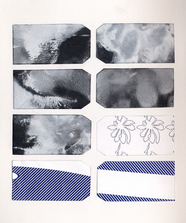
I had already gathered several elements together prior to commencing this project – very mundane items – envelopes, labels, tickets – like the vintage map, they too, had been waiting for their moment. I opened the envelopes out, their interiors like abstract landscapes, their tiny repeating patterns seeming to create a layer of map notation. Envelopes containing communications that physically travel many miles; labels that denote destination, identity or location; tickets with their punched out holes marking journey progression – I wanted to reinterpret these simple everyday items and bring them together in a meaningful way.
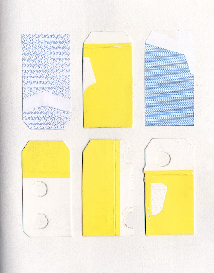
Exploring these concepts through drawings and collages, using Photoshop where appropriate to build up small-scale repeats, these initial stages of development were lengthy, as I worked my way through a variety of approaches and with emphasis on different aspects of the various source elements. I try to keep as open a mind as possible when planning and developing new work, but sometimes it is very difficult to keep clear of preconceived ideas. They need to be put to one side, turned inside out and upside down before being either discarded or used again.
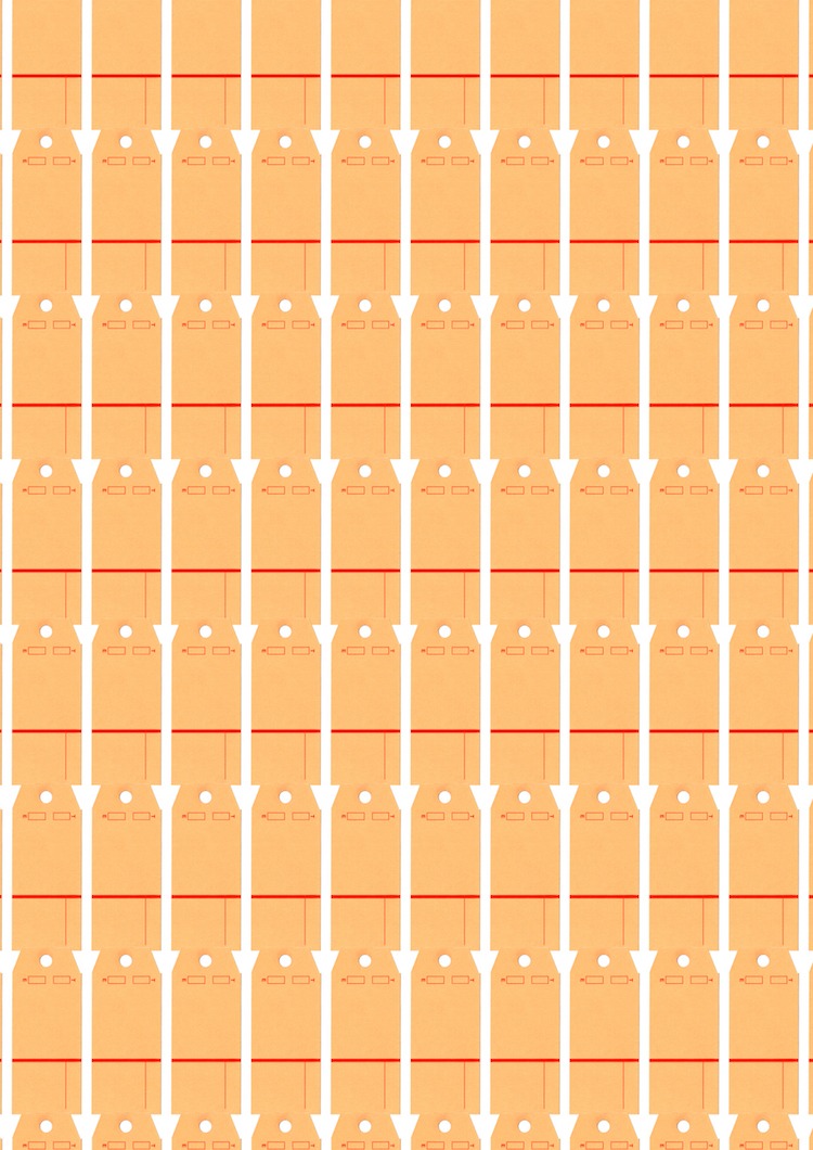
Travelling its own route

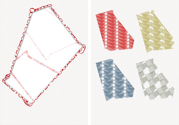
The exact nature and format of the CPJ began to take shape as the ideas evolved. As the individual components presented themselves, they followed a loose definition of three themes or ‘structures’ for possible works, based on envelopes, tickets, and labels. Each has its own journey and like the chosen work itself must travel its own route. I, therefore, decided to structure the CPJ as an unfolding map that revealed the three themes, numbering each section chronologically.
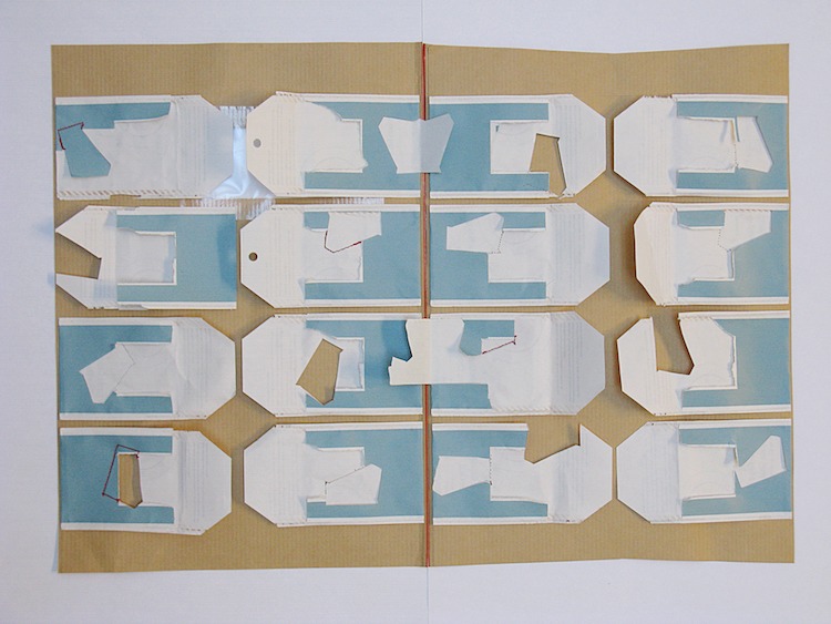
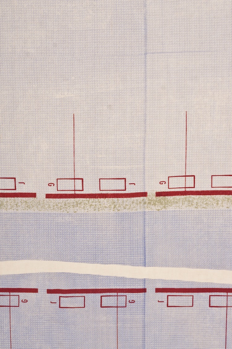
Ultimately, these multiple ideas had to be filtered and key elements selected to arrive at a final composition for this one piece of work. I focused on using the ‘journey shape’ as the main image (the middle, dark blue one being created from lines of stamped numbers cut in half), with references to envelopes (compositional structure and tiny, repeating pattern), and Royal Mail mailbag labels with specific initials added (red grid). This was printed out to scale (1:10) and used as a reference when marking out print positions and placing stencils.
Processes and techniques
Was there any other preparatory work?
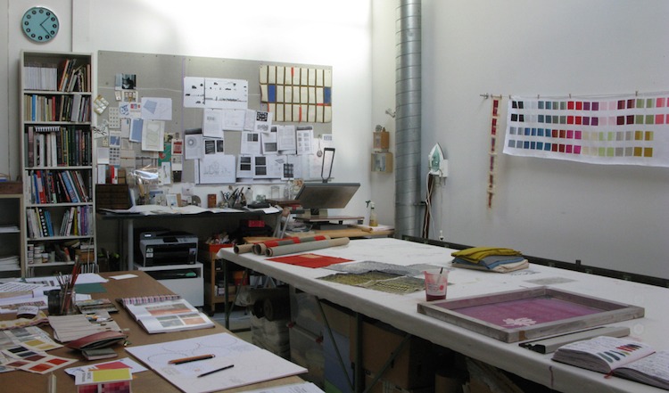
A big part of the preparation is making the screens. All the imagery was created at the correct scale and resolution – I did this in Photoshop – and printed out onto film. These film ‘positives’ have to be opaque enough to block out UV light. Screens were cleaned, coated with light-sensitive emulsion, exposed under UV light and carefully washed out. The emulsion remains soft in areas where the light is unable to pass, and washes away, leaving open mesh where the design will be printed. The screens were checked on the light box and any pinholes touched up with emulsion and a brush; two layers of interlocking gummed paper tape were applied around the screen to ensure no ink leaks though any gaps between the frame and emulsion.
What materials were used in the creation of the piece? How did you select them? Where did you source them?
I chose to work on ‘red edge linen’ from Whaleys (Bradford). An Irish linen that is closely woven, it has an almost ‘papery’ feel when ironed, as well as a really nice grain on which to print. As the name suggests, it also has a wonderful red stripe running through the selvedge. I used print pastes made from Reactive dyes and a weak discharge, which lifts out the colour.
What equipment did you use in the creation of the piece and how was it used?
The whole piece is screen-printed, using either photographic or blank screens with stencils.
Take us through the creation of the piece stage by stage.
First the red edge linen has to be scoured to remove waxes and impurities present in the fibres when it was woven, otherwise, it won’t accept dye or print pastes. The cloth is boiled for 30 minutes in a solution of sodium carbonate and a pH-neutral detergent, during which time the water turns a bright orange-yellow.
I often dye my cloth before printing, as I like the extra layer this gives, from which I can strip away colour. The red edge linen, however, is an unbleached fabric and I felt in this instance I wanted to work straight onto the natural background colour.
Colours and discharge are mixed and tested and sampling is carried out; I usually select key areas from the composition, so that each section is represented in sample form before I begin.
Cloth is pinned into a ‘backing cloth’ that is ironed to the gummed neoprene surface of the table. Care has to be taken to make sure the fabric is held fairly taut but not distorted. As this piece goes across the full width of the fabric, I measured and marked out top and bottom using tensioned thread, ensuring everything is square.
Firstly, I made my large-scale positive stencil (to create negative space under the first print) loosely derived from the interior of an opened out envelope, which gives the piece some of its compositional structure. I usually use ‘Kodatrace’ (polyester drafting film) for this, as it is stable when wet, won’t tear, and can be washed and re-used; I often utilise both the positive and negative shapes.
The first layer of print was then applied using the very small-scale ‘envelope’ pattern repeat, which was printed horizontally in pale blue across the full width of the cloth in two-thirds / one-third proportions down the entire length. I allowed a small overlap between horizontal prints to create a subtle, darker vertical line right the way down.
A series of journeys
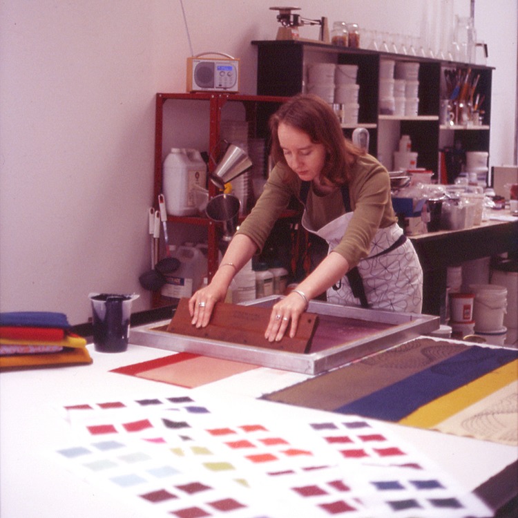
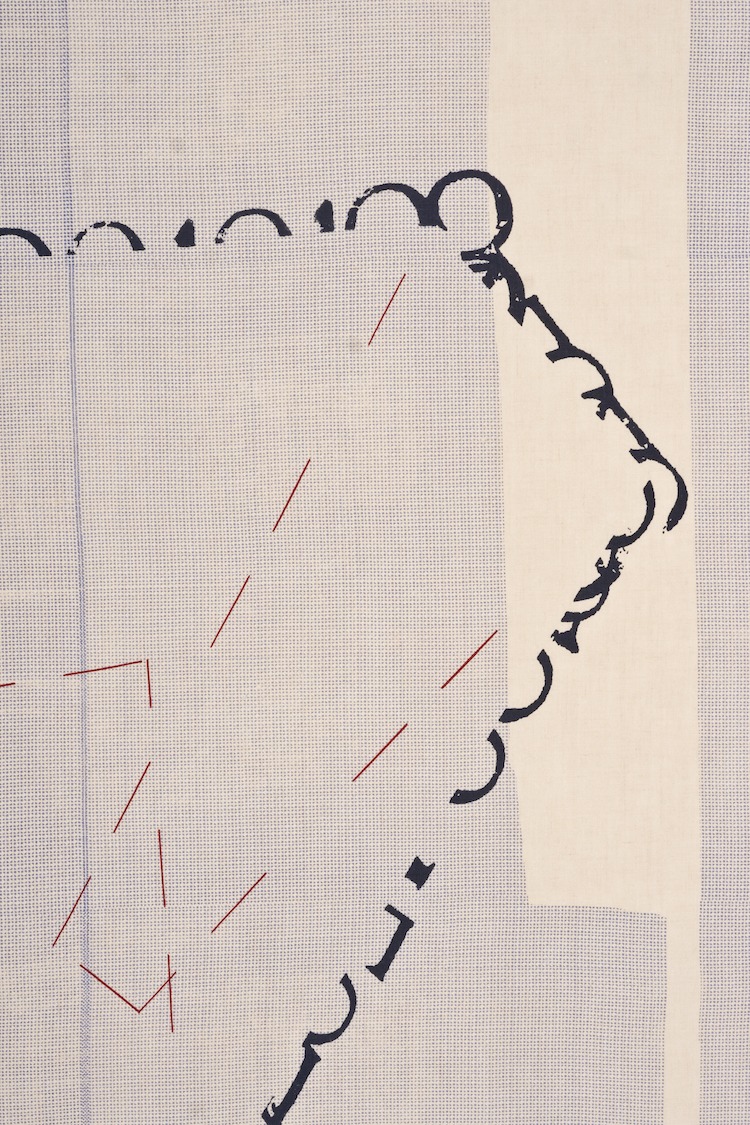
The first main ‘journey’ shape at the top was made as a negative stencil and stuck down carefully to the fabric. I then used a blank screen to print a weak discharge within this shape; this was done in sections that fitted the journey route, rotating the screen accordingly to create different ‘off-set’ effects; these optical properties become more or less apparent depending on the distance you stand from the work.
The fabric was then unpinned, rolled and steamed for 50 minutes in the bullet steamer. It was subsequently washed in the following sequence – cold until clear / hot 85° with pH-neutral detergent for 2 minutes / cold until clear – then lightly spun and ironed dry on the reverse (to bring up the grain again on the print side). Although it is impossible to exactly match prints after washing, care has to be taken not to distort the cloth when ironing otherwise correct positioning of subsequent prints can be difficult.
After repinning the cloth to the print table and marking out, the second ‘journey’ shape was printed in dark blue. Then the envelope stencil was put back down and the red ‘grid’ was printed at the bottom, followed by the olive green stippled ‘journey’ shape.
The positive journey shape stencil at the top was put down over the discharged area and other areas masked off so that the surrounding space could then be built up in the pale blue using the small-scale envelope repeat horizontally as before. This print routine was repeated within the third journey shape at the bottom.
The sequence of numbers was printed in the mustard-gold along the top LHS selvedge. I used tensioned thread to mark out the positioning of the red dashed lines within the middle (dark blue) journey shape and printed these utilising the grid screen.
The fabric was then unpinned, rolled and steamed for a further 50 minutes, finishing with the same washing and ironing sequence. The top and bottom were hemmed and eyelets put in at intervals along the top for hanging.
What journey has the piece been on since its creation?
The Shape of Things has been shown as part of the staff exhibition Awaken at Glasgow School of Art (2009); at the Hub with the 62 Group (2009) and in Journeys at the Ormskirk Gallery, Lancashire (2012). It is not for sale, due to the specific nature of its content and its place in my creative journey.
For more information visit: www.joannakinnerslytaylor.com
Have you ever been put off trying screenprinting because you think it will take too long to master and the equipment will be too expensive? Check out a fantastic opportunity to quickly learn how to screenprint at home without the need for costly professional kit here!

Comments