Caren Garfen is known for tackling tough topics. She juxtaposes seemingly simple textiles with complex issues like eating disorders to create compelling and informative installation art. Caren’s art does not hang neatly on a wall. Instead, she creates provocative examinations of issues that especially affect women.
Her latest installation art called ‘Room for Improvement’ is a classic example that exposes the overwhelming disparity between the need for and availability of services related to eating disorders in the UK. This ‘From conception to creation’ article gives you an inside look at how that work came to life, as well as introduces you to the considerations and techniques that go into ‘installation art’ in general.
Caren’s work has been exhibited widely in the UK and Europe, as well as Japan, United States, Canada and Australia. She recently received the prestigious Textile Society Development Award and has been a member of The 62 Group of Textile Artists since 2008.
Name of piece: Room for Improvement
Year of piece: 2018
Techniques and materials used: Hand stitching, silk threads, cotton material, dolls house beds, wadding
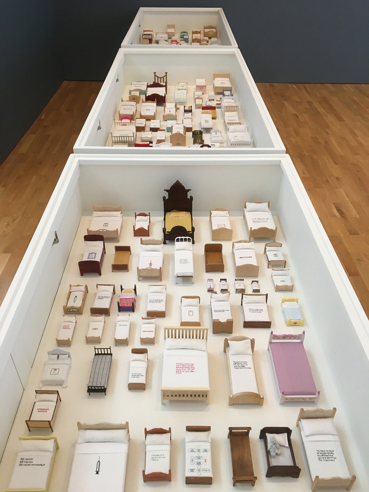
Size of piece: 260cm x 50cm x 12cm
From newscast to installation art…
How did the idea for the piece come about? What was your inspiration?
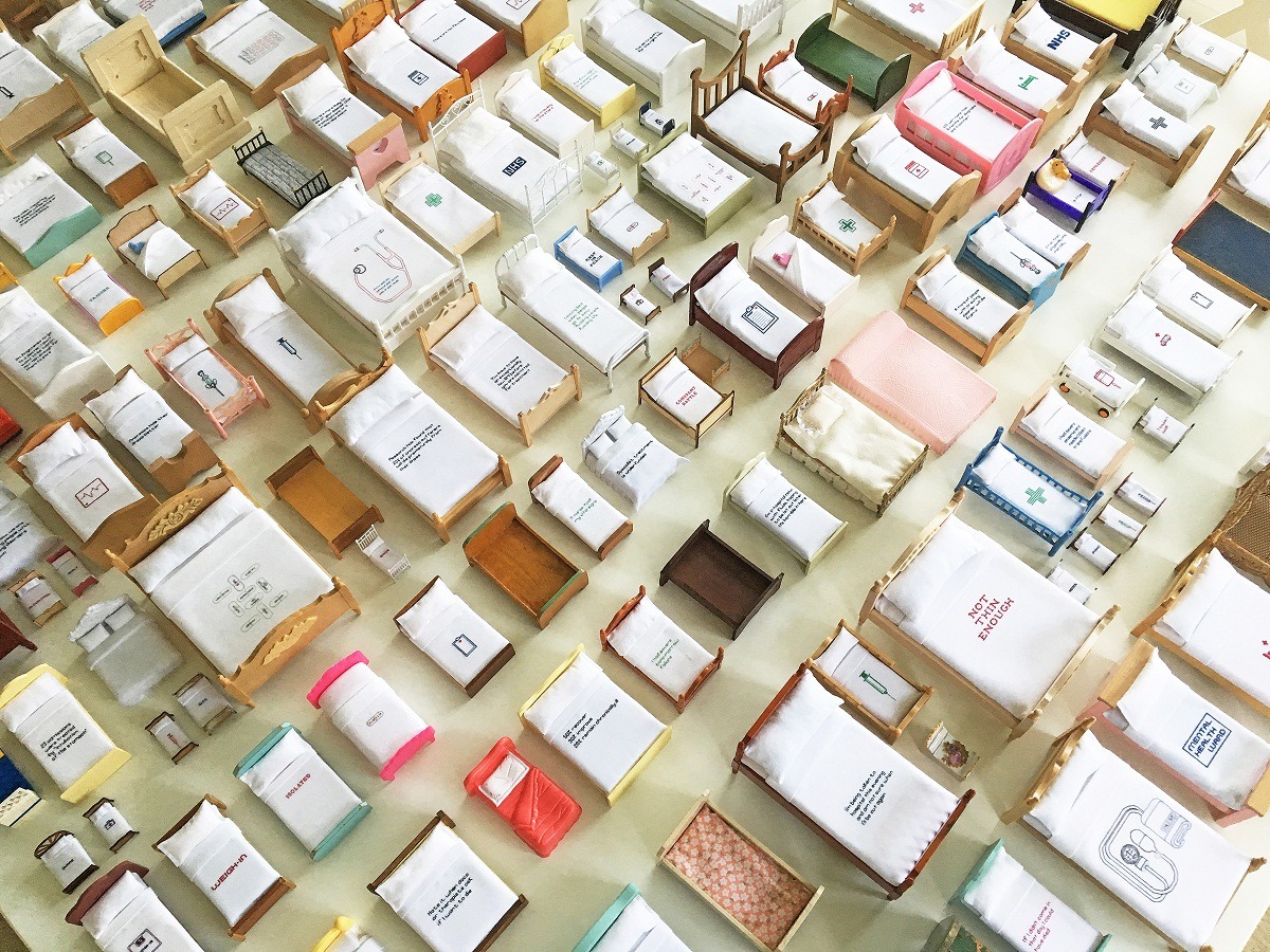
Caren Garfen: I was viewing a 2017 Channel 4 documentary called Wasting Away in which journalist Mark Austin reported ‘there are just 202 NHS beds in the whole of the UK for children and young people with eating disorders.’ He added the number of sufferers in the UK was thought to be 1.2 million.
It was fascinating listening to both his statistics and his opening up about his own daughter’s journey through her anorexia nervosa to her recovery. The figures resonated in my mind, and I kept thinking about them, especially the lack of beds.
‘Room for Improvement’ was the result.
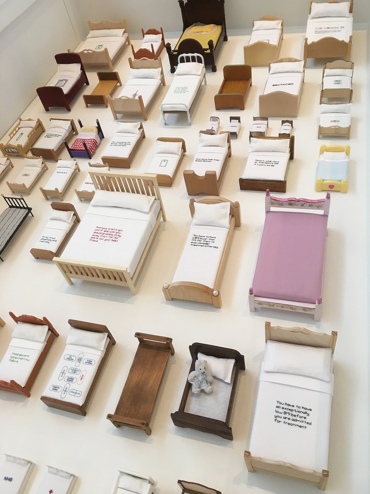
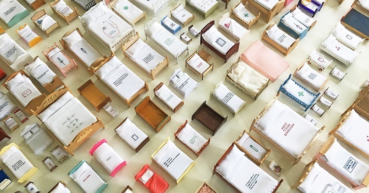
I decided to use 202 doll-house beds to create a miniature installation. I felt the toy beds would conjure a feeling of childhood innocence. And they also served as a stark reminder that although eating disorders usually appear during adolescence, a worrying number of cases are also being seen in children as young as seven or eight.
The beds and the stitched text were different sizes to emphasize scale and allude to sufferers often having a distorted view of their body size.
What research did you do before you started to make?
I have been researching eating disorders over the past four years, studying from the sufferers’, parents’ and medical professionals’ points of view. I have about 11 sketchbooks filled with facts, ideas and drawings. I’ve also created numerous artworks and have attended and exhibited at three eating disorder conferences.
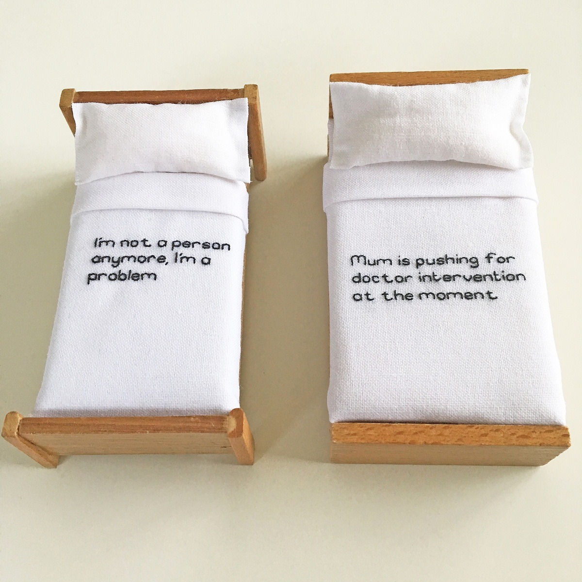
The text used on the bed covers comes from various sources, including personal accounts from people suffering from eating disorders and anonymous tweets on social media.
I was submitting this piece for a particular 62 Group of Textile Artists exhibition called ‘Ctrl/Shift,’ so I needed to follow that brief. It took ‘shifts and changes’ as its theme, focusing on artists whose practice is changing or has changed in small or significant ways.
In my case, I had been intending to change my attitude toward ‘control,’ having become aware that I could over-control my work. I realised that relinquishing a measure of control could help the artwork breathe more freely and be liberating.
It meant arguably less work for me. And also, as in the case of ‘Room for Improvement,’ it allowed for pauses in the stitched dialogue where some beds have been left untouched, giving the viewer time to mediate on the work.
There was also a shift on the practical side, in that I had decided to stop using silkscreen printing in my practice to concentrate solely on hand stitching.

‘Installation Art’ immerses viewers in remarkable ways
Was there any other preparatory work?
I had the mammoth task of sourcing 202 dollhouse beds. I only had six myself, so I put a call out on social media seeking contributions. That resulted in about 10 more beds, which while very much appreciated, also made me realize I had a long way to go.
I then visited dollhouse fairs, and one particular stand very kindly donated a selection of beds. Ebay was also great fun, and I was able to pick up some lovely vintage pieces at reasonable prices. Ultimately, though, the vast majority were obtained from a specialized dollhouse shop.
What led you to choose an “installation” versus traditional hanging art presentation for this work?
I was very interested in the scale of the piece. My original thought was the beds should be presented in a sterile hospital ward. They would take up very little space, and the viewer would be able to see at a glance there are too few hospital beds available to those who really need them.
Of course, this was not possible in ‘Ctrl/Shift,’ but I think I will look into displaying the work that way in the future.

What goes into planning for art that is “installed?”
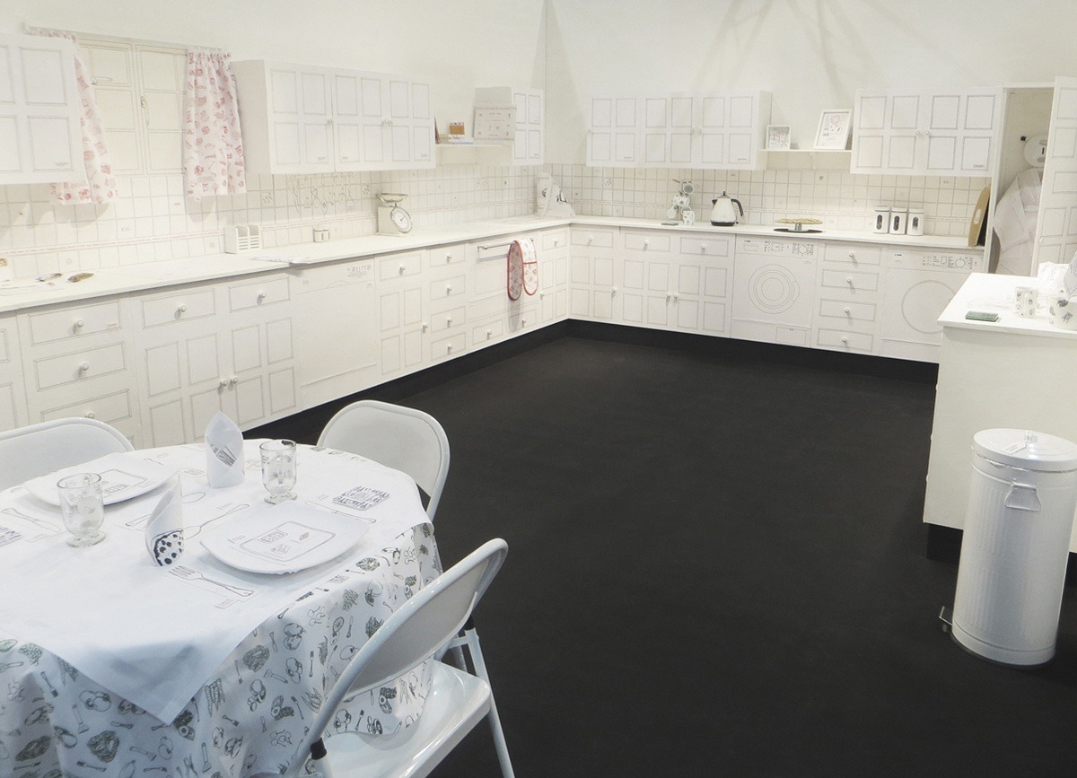
I have created two full-size installations. The first was a kitchen installation that dealt with women and dieting (2014). The planning was intensive as I had to design a kitchen to scale so it would fit a designated space.
To give a visual awareness of the space needed, I made paper templates of the wall and floor cupboards and white goods. These were essential, as plinths were constructed off-site and brought to the exhibition only two days before the show opened. Everything was custom, so there was little room for error.
The plinths were then covered in screen-printed textiles with volunteer help.
The second installation in 2018 was much easier, as the only built-in unit was a cupboard. However, because the artwork was in the form of a bedroom, it was necessary to purchase a full-sized bed, chest of drawers, bedside table and desk, and other accessories. Most of the furniture was flat-packed, which meant my front room resembled a warehouse for a couple of months!
Moving the flat-packs to the site wasn’t too difficult, but once built and actually placed in the space, a few issues arose. Ultimately they had to be stored by a freight company before they moved them on to two other venues.
In both cases, the gallery space was designed so visitors had to walk into an enclosed space. The gallery was cut off from the main exhibition and was carpeted in black, unlike the rest of the halls that were in grey.
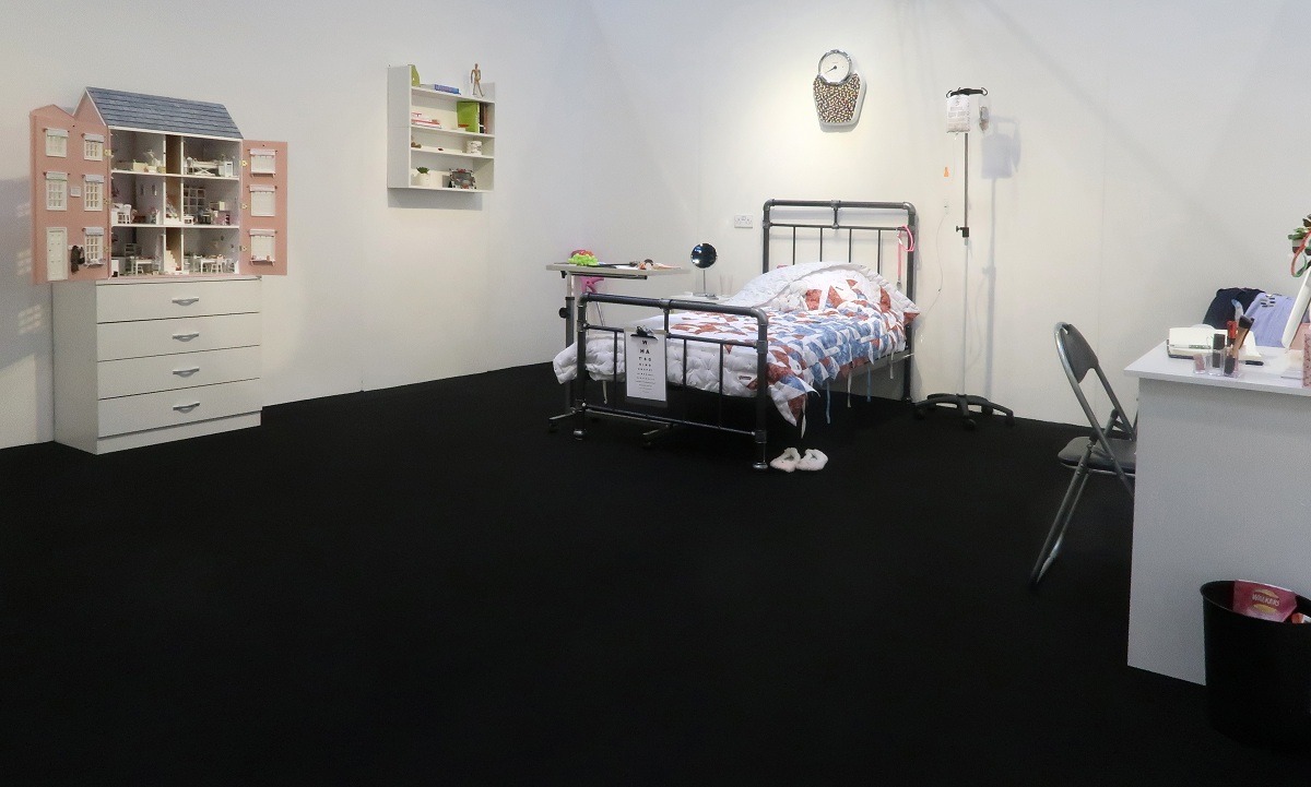
It was interesting how visitors seemed to find the spaces as being ‘safe places’ to talk, especially for the bedroom installation. A diary was left in the bedroom for visitors to write about their experiences with eating disorders. The whole process was overwhelming for many viewers, and I found it difficult myself as raw emotions were laid bare.
There is a real difference between permanent and impermanent art. For impermanent art, it’s essential to have recorded evidence in the form of video and images so the art isn’t lost forever.
In the case of the kitchen, it was only shown at two venues, and afterwards, the textiles were removed and the plinths were sent back to the maker. It’s unlikely the piece will be shown again because of technicalities. Yet, it seems to remain in the minds of some who saw it, as they are still talking about it four years later!
On the other hand, I’m hopeful the 2018 bedroom installation will be exhibited again in the future.
Adding meaning through quotes and motifs
Take us through the creation of the piece stage by stage
While collecting the miniature beds, I also began trawling through my sketchbooks to find the most suitable quotes to stitch. Examples include: ‘My bones have been feeding off themselves.’ ‘People are turned away by the health system, told they aren’t “ill” enough for treatment.’ ‘Mum is pushing for doctor intervention at the moment.’
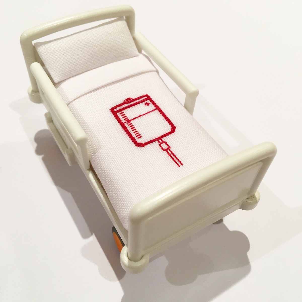
When it came to the motifs, I went through Google images to find medical logos or signs found in hospitals. Other designs included tiny stethoscopes, skeletons, pills, drip bags, and cannulas that were drawn on graph paper and then stitched on the miniature bedcovers.
The beds’ mattresses, pillows and under-sheets were made from foam, kapok and white cotton fabrics.
As the work progressed, I needed to think about the title of the piece, which is of huge importance to me in every artwork I create. It can take a few minutes or a few weeks to resolve.
‘Room for Improvement’ took a few days. It highlights the need for improving the facilities for eating disorder patients. I was similarly looking at the sufferers themselves and the need to improve their physical and mental condition.
I also had an idea that the artwork would work well displayed in a room setting to emphasise the dismal lack of beds available nationwide.
I was delighted when the piece was selected for ‘Ctrl/Shift,’ but I was concerned how the work would be displayed, especially with so many small parts. I looked into some options, but they proved impractical. A chance discovery of an image at the gallery at MAC showed some perfect display cases. An email or two later and it was confirmed they were available, painted white, and inset with glass covers.
What journey has the piece been on since its creation?
This piece started its journey at MAC Birmingham as part of the aforementioned ‘Ctrl/Shift’ show. That exhibition will be on tour again next year, and you can find more information at www.62group.org.uk/exhibitions
For more information about Caren’s work and other exhibitions visit www.carengarfen.com, you can also watch this interview with Caren.
Have you ever created art to address a societal challenge? Let us know by commenting below.

5 comments
Annmarie
In the 70s I made and gave away or sold lots of hangings, cushions and quilts with feminist messages and contributed to the wonderful ‘Subversive Stich’. Sadly I have no photos of anything I made, but I am now, in my late 60s returning to subversive sewing!
rose
a thought provoking installation – who knew how few places for this illness, is it an illness? a disease? i suppose like me the thought was, suck it up, man up or pull yourself together…. and that clearly is not the way forward for so many people. i hope it is viewed by lots of people and that something can be done.
Tilleke Schwarz
Wonderful installation, Caren!
Elizabeth Tipton
What an incredibly poignant piece for an overwhelming problem. It so clearly states the situation. Brilliant.
Susan Shafrir
Yes,I was commissioned by UNESCO..Bioethics, to create a collection of art works showing actual cases where legal judgements had not always been very humane. I researched enormously for each individual case, all being totally different from the other. Then the ‘creating’ process began…mixed media with free macine and hand embroidery. 16 of my works were displayed at the World Congress on Bioethics called “Weight of words, Power of pictures” . This was a world first. The UNESCO aim was to use art as an additional tool in the teaching of Bioethics to medical and law students