We perceive life in layers: backgrounds, middle areas and foregrounds juxtapose in shifting ways. And we create meaning from those layers that suggest distance, time and space.
While we may be stating the obvious, for an artist, those layers can pose a real challenge, especially in a 2D format. It calls for careful observation and experimentation, which is exactly what Cherilyn Martin cherishes about her creative process.
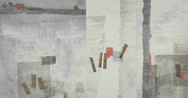
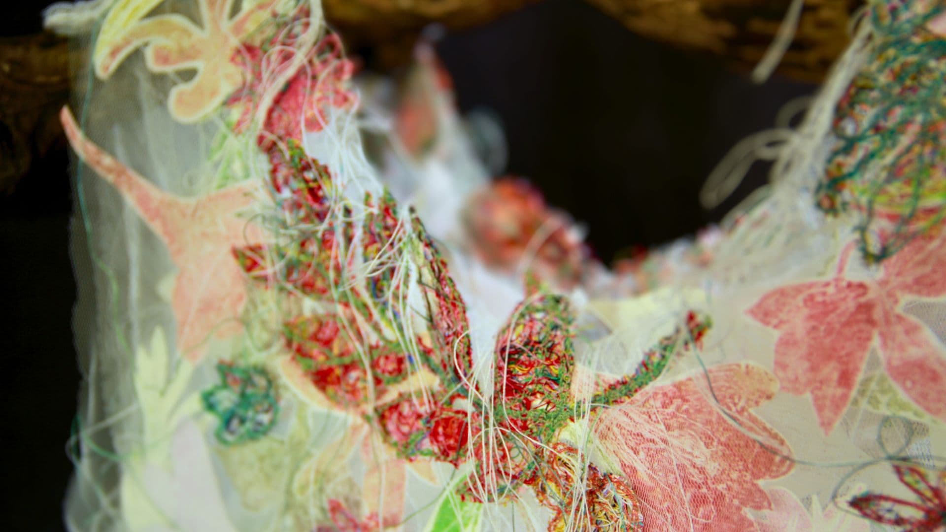
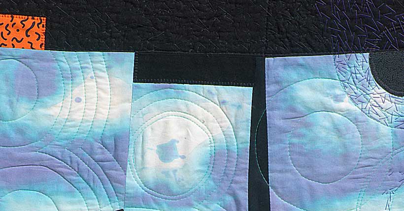
Cherilyn masterfully layers fabrics and papers and then enhances these with multiple layers of hand and machine stitch. Seen from a distance, everything merges exquisitely. But upon closer examination, viewers discover rich complexities in stitch, colour and the inclusion of text.
While Cherilyn’s designs may seem abstract, there is researched intent behind all her work. And she’s now sharing her creative process, along with tips and techniques for incorporating printed text into her art. You’ll also discover some interesting techniques for stitching on paper, as well as her love for encaustic layering.
Working with layers
Cherilyn: Layering has played an important role in all aspects of my work. Layers are what we see when we view the world around us. For example, whilst sketching and photographing in Pompeii, I became aware of the juxtaposition of its ruins. Broken walls and columns were superimposed on each other, creating depth in the landscape.
I like to push the boundaries of quilt making, as I don’t want to be confined to the square or rectangular forms usually associated with quilts. So, I layer multiple panels of already quilted and embroidered works to create greater depth of composition.
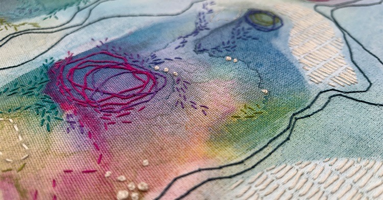
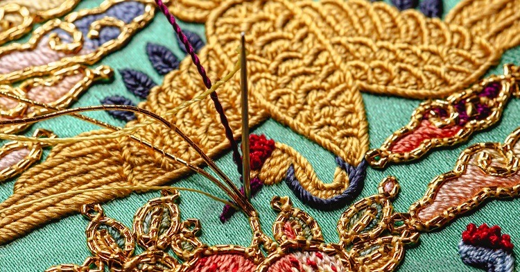
Layering is also present in my heavily stitched surfaces. It’s fascinating how stitchwork can create depth. I use thicker threads as a first layer and then work stitches on top with different thread weights to create maximum texture. I then usually finish the last layer with a thin machine thread.
Using layers of different thread colours on the surface is also exciting. For example, strategically using darker and lighter tones helps create shadows and depth.
My encaustic work also consists of layering paper, medium and colour. The magic of encaustic medium is that the individual layers become more translucent over time. I enjoy building up layers of thin papers in the warm encaustic medium to create collages, which become translucent with time. Slowly the layers become more visible.


Textiles from the past
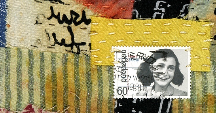
I often incorporate old antique pieces of textiles into my work, as my concepts tend to focus upon memory, bereavement and commemoration. They also lead me to consider clothing and accessories as representations of lives passed.
Most of my textile pieces are ‘found’, and each has its own story to tell. I try to preserve their history whilst adding my own story to breathe life into what was once discarded by others.
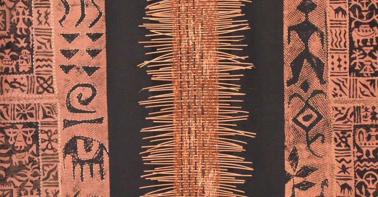
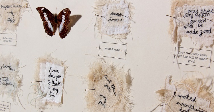
Both Pillow Books and Seven Souls feature several antique textile accessories, including an antique mourning bonnet, pieces of traditional costume, antique lace collars and gloves. Seven Souls is particularly meaningful to me. It evolved from a pile of oily industrial cotton bags once used to store machinery. Upon washing and drying them, I began to see forms in them which reminded me of some sort of garment or even shroud. Each piece slowly took on a character of its own and seemed to have its own story to tell. Adding poignant texts and pieces from my personal collection of antique textiles transformed those forms into haunting suggestions of faded lives.
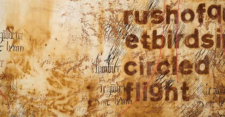
Later works in the Silent Dialogue series are made from antique linen that shows signs of ageing and staining. Antique lace collars were added, as well as embroidered handkerchiefs from my collection. I then hand embroidered and stencilled expressive texts using either puff paste or controlled rusting.
Ultimately, I choose materials which best convey my message. And my work is led by the materials I have to hand. I do often switch from working with cloth to paper, as I think it keeps my work fresh. It is very easy to become repetitive when working long stretches on one piece or series.


Threaded surface design
Stitching has always been a passion. The versatility of stitch to explore both textural qualities and add graphic elements to a work still fascinates me. I started my career as a fervent machine embroiderer, but I turned to hand embroidery to add extra dimension to my pieces.
My favourite stitches have always been line stitches, such as fly stitch and blanket stitch. Apart from their lineal quality, they are also ‘open’ stitches that can be used to fill the surface. They’re also easy to distort and to work in several layers.
My favourite texture stitches are French knot and bullion stitch. I enjoy using hand-dyed cotton threads, although I usually add a bit of metallic thread (usually gold machine thread) to add a highlight to the surface.
Working on paper has also influenced my use of stitch. Because paper is less flexible, it is more difficult to hand stitch. So, I always reinforce my paper with an iron-on cotton or Vilene. This ensures the paper won’t split whilst stitching, especially when machine stitching. I also usually end up stab stitching, as it’s much more difficult to create a rhythm whilst hand stitching on paper.
Another technique I use is natural and controlled rusting to add an aged effect to fabric. A full description of my techniques can be found in my book Interpreting Themes in Textile Art. Natural rusting is great for organic effects, whilst controlled rusting can be used to add detail.
Lastly, I make my own stencils from freezer paper for lettering and use my own images on Thermofax screens for printing.


Ancient texts
I often use text not only as a graphic element, but to also add content to the work. I incorporate texts I come across whilst researching a theme. Texts are usually centuries-old poems, prayers or hymns. I also write my own texts or borrow texts written by family members.
I let words tumble into each other, as I don’t particularly want the viewer to become fixated on just reading the text. Instead, I want viewers to look at the piece as a whole.
I sometimes use text fonts directly from their source. I’ll sketch or photograph the image when visiting places such as an archaeological site or an old mining system (It’s the Stones That Speak VII). I also look for other surface ‘marks left by man’ such as sgraffito or graffiti. I’ll then make a more precise drawing in the studio which can then be used to create a Thermofax screen.
When using a printed text, I use one of my commercial alphabet sets to interpret the content. I have a collection of different fonts, so I chose the style that best suits the content.
I then use a range of techniques and mediums to apply text to fabric or other substrate I’m using. Thermofax screens are a favourite as they allow me to print in different formats. I regularly use textile paint, puff paste, acrylic wax and rusting power, textile glue and transfer foils. I love the diversity of this printing technique, and once a Thermofax screen is made, it can be used indefinitely when handled with care.
I also hand cut my own stencils from freezer paper. I draw around the text and then cut it out with a sharp craft knife. I then iron the stencil onto fabric and apply different mediums to the surface. Unfortunately, the stencils can only be used once, but I love the precision of the resulting print.
I’ve had success with heat transfer printing for which I cut out texts from papers painted with transfer paint. This method is particularly suitable for printing polyester, cotton/synthetic mix fabrics and non-wovens. It’s interesting to print with both the cut-out letters and the remaining stencil.
And lastly, I sometimes hand stitch texts onto my work. I draw the letters with a pencil directly onto fabric, and then use a simple backstitch to follow the drawn lines.


The art of subtlety
I work ton sur ton (in matching shades) making the text almost invisible. This engages the viewer, creating an intimacy between the object, the viewer and the maker.
Silent Dialogue No. 6 is a good example o ton sur ton hand stitching and white puff paste stencilled text (which is very difficult to photograph). Stitching Across Generations is a much more colourful example of a similar goal. I used a well-used tray cloth embroidered by my mother, and I added my own text, which is entwined with her original embroidery across the surface. I tried not to dominate the original design, so it takes viewers some effort to decipher my text, which again, creates an intimacy between the two layers of stitching and the viewer.
I am in search of simplicity and aim to create subtle surfaces which invite the observer in for a closer look at the work.
I also make artist books such as leporellos (also known as concertina books) where material is folded into an accordion pleat style. I’m interested in making the transition from 2D to 3D by creating simple spatial forms from a flat sheet of paper or other material. I am intrigued by the shapes that occur as pages are turned or are worn with age and frequent use.
Pages 1, 2 and 3 are separate works from a series made from fused layers of plastic and mixed media. I then screen printed them with text and mounted them on stretchers.


Creative influences
My mother was the greatest creative influence in my early life. She was a prolific maker of home furnishings, sewed almost all our clothes and always had an embroidery project on the go. Consequently, we children were taught a wide range of techniques. She was a perfectionist, so any project we embarked upon had to be made with care!
Through my education, I was also lucky to have art teachers who had an affinity with textiles and who encouraged me to consider embroidery as an art form. As a teenager, I discovered Anne Butler’s book Simple Stitches which was a pivotal moment. It demonstrated the possibilities of stitching.
I took the classical route to becoming a professional artist. Upon completion of a foundation course at Art School in Birmingham, I was accepted into the degree course in the textile department at Manchester Metropolitan University (MMU). Further studies in Art Education at Bristol University completed my formal education.
I think all of these experiences helped form a deep-rooted artistic and aesthetic sensibility in me. I was fascinated by all the possibilities textiles have to offer: fashion, embroidery, weaving, surface design and the possibility of working in both 2D and 3D.


7 comments
Regina Dunn
Thanks for an inspiring and informative article. The artworks are beautiful and intriguing.
Patt
A recent member of the site, I can’t stress enough how much I enjoy your work and reading about your process, particularly the role of rust dyeing. Your book is on its way to me. Hours of enjoyment and study ahead.
Bernadette
Stunning!
Helen Marino
I enjoyed reading your story and seeing your creative work. Interpreting Themes in Textile Art
is an inspiring and helpful book.
Martha Mihaly Black
What a wonderful article on a fascinating approach. I loved learning about Cherilyn’s evolution as a textile artist and her understanding of the layering process. I am an American collage hobbyist just starting to incorporate stitching into my pieces. I’m finding that many stitchery artists are located in GB. Does anyone know why there seems to be such a concentration of talent there?
Happy new year! Here’s to a layered life!
Maris Sharp
Sorry should read – the work OR the the title of the work
Maris Sharp
Interesting work. I would love to know – what comes first – the work of the title of the work?
I hardly ever get from anyone’s textile piece what the title means or how it relates to the work
Thanks