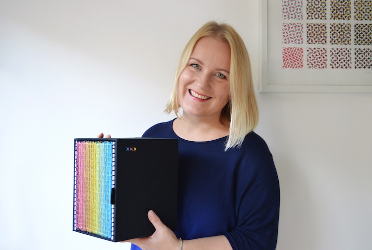
Evelin Kasikov is a former advertising art director turned typographic artist and illustrator. Originally from Estonia, she moved to London in 2006 to study for a master’s degree at Central Saint Martins. After graduating in 2008 Evelin set up her own studio focusing on handmade illustrations, book art and editorial design. She says:
I think my greatest achievement is not a single project or an award, I never enter any. I’m happy that I have found my own way in design, I enjoy making my work and I’m able to keep doing what I love.
In this article, Evelin talks us through the creation of her piece XXXX Swatchbook. We learn about the various techniques employed and the years of hard work and sheer dedication poured into producing this extraordinary piece of art.
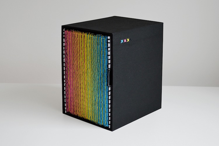
Name of piece: XXXX Swatchbook
Year of piece: 2016
Size of piece: Book, 180 mm (W) x 210 mm(H)
Materials used: Paper, Embroidery thread, Cardboard, Bookbinding cloth
Techniques used: Graphic Design, Hand Embroidery, Book Binding.
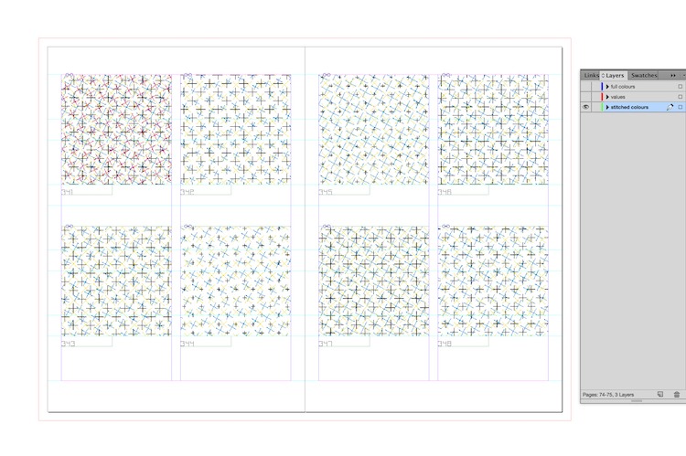
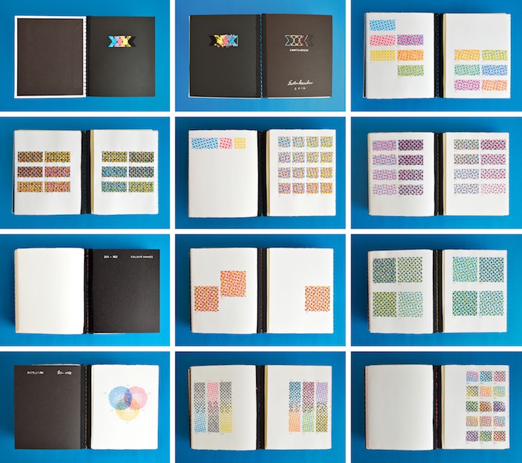
The whole book was designed in Adobe InDesign, then the pages were hand-stitched.
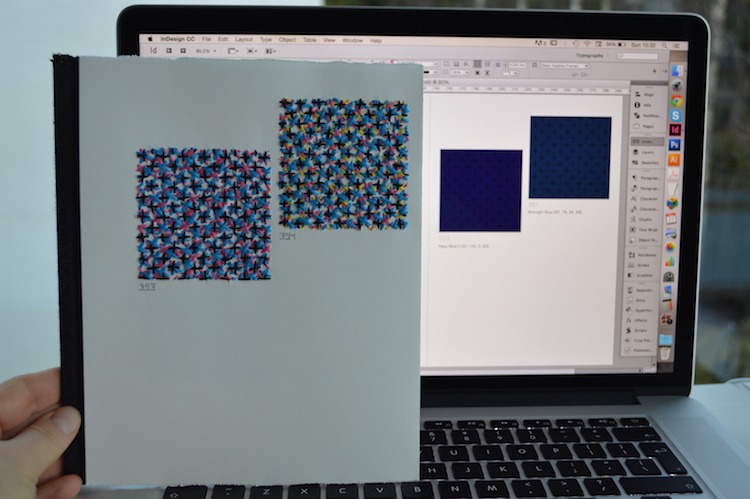
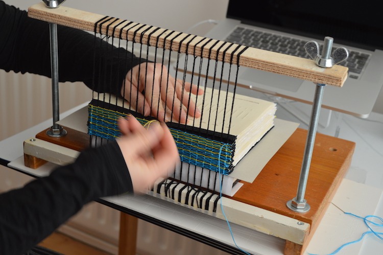
The final book was hand-bound using book binding frame and tightly spaced cords. I also made a slipcase with pull out ribbon.
A book about print
TextileArtist.org: How did the idea for the piece come about? What was your inspiration?
Evelin Kasikov: The idea first came to me sometime late in 2010. I had developed CMYK embroidery technique during my MA at Central Saint Martins and was starting to get stitched illustration commissions. For the Guardian piece, I was asked to match my stitched colours with exact colours from their chosen colour palette.
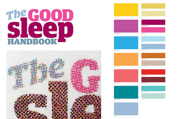
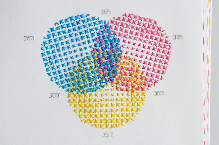
That was a bit of a challenge, I knew I could make green, but can I make that special blue-ish dark green? Cross-stitched colour separation is, after all, a huge enlargement of halftone screens used in print. The project was successful and the colours turned out very similar. That gave me the idea of a stitched colour swatchbook.
As a graphic designer, I had been using Pantone colour guides for years. How cool would it be to make an entirely handmade version of it, with hundreds of hand-embroidered colour swatches. A book about print but printed without a trace of ink. The idea of a huge personal project was appealing to me: if it takes years to complete, so be it.
Also, embroidery is usually perceived as something emotional and feminine. I wanted to explore the opposite direction: analytical and mathematical embroidery. As a book designer, I design books for commercial publishers. With this project, I wanted to combine my love for craft with my professional book design skills.
What research did you do before you started to make?
At first, I studied different colour systems that I could possibly use as a base for my work. But I could not find a well-known frame of reference to suit my purpose.
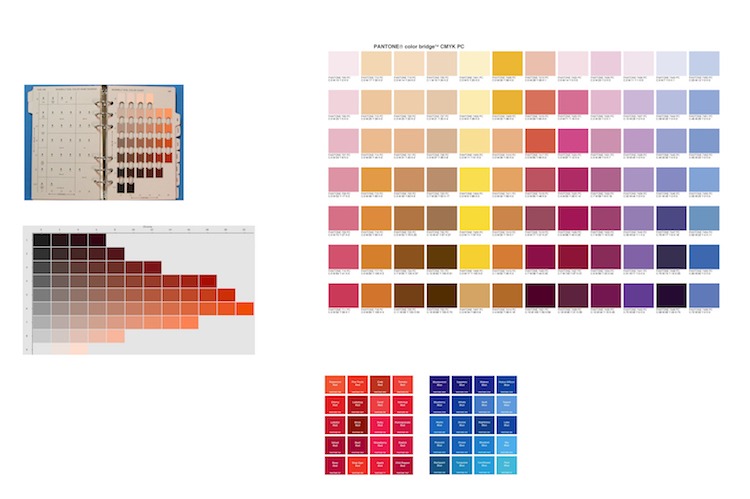
Colour systems such as Munsell and Pantone were too extensive with too many similar shades. There was no point to stitch a huge collection of yellow swatches with not much difference between them. It had to be realistic and it had to make sense in embroidery.
Every swatch had to be distinctive, any repetition would have been a waste of time. I wanted to have fun with it, take a playful approach to colour and most importantly, I didn’t want to embark on a life-long project.
So I decided to divide the book into sections, starting with single screens of Cyan, Magenta, Yellow and Black, followed by primary, secondary and tertiary colours, then systematic combinations between colours and finally groups of common colour names such as Turquoise or Emerald. At a later stage, I added a final section of gradients.
My love for craft
Was there any other preparatory work?
Once I had decided on the structure, I had to work out the design elements: format, grid, layout and typeface. I wanted a flexible grid system that accommodates a maximum variety of swatch sizes. Another important decision was the the density of crosses in swatches.
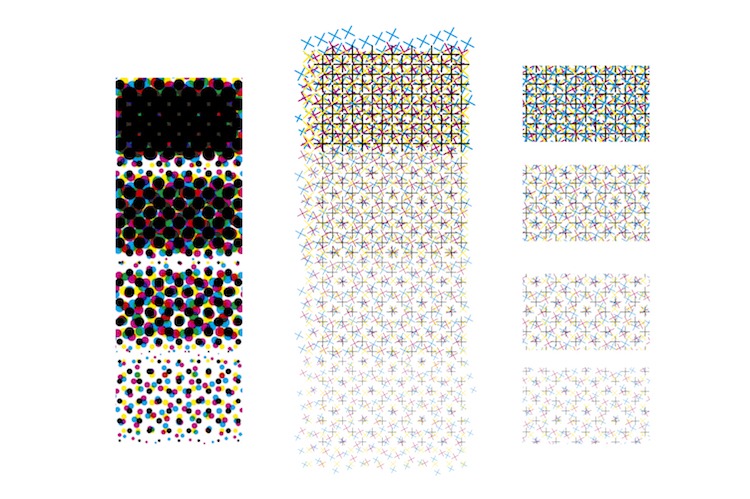
Stitches swatches had to be dense enough to give accurate reading of colour (but too dense crosses would have created too much extra work). Spine design also took several rounds of sketches.
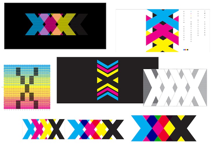
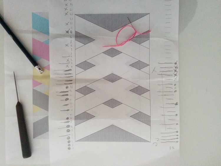
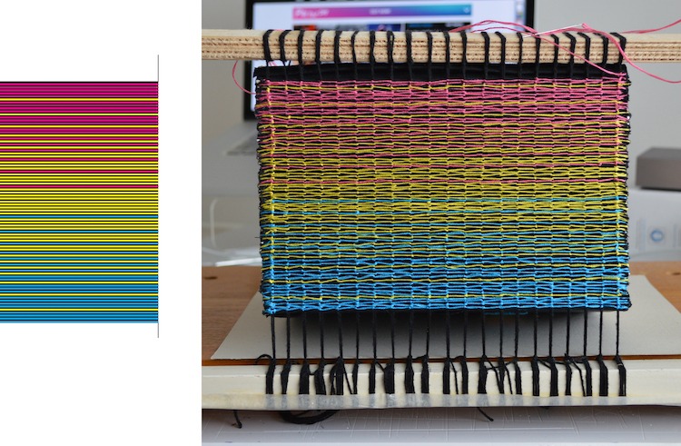
At first I wanted to get four big crosses on spine, as they refer to the element X used in cross-stitch. But, looking at the whole cover design, I decided to go for a minimal, gradient spine.
What materials were used in the creation of the piece? How did you select them? Where did you source them?
I stitch on paper using stranded cotton in four CMYK colours: Cyan, Magenta, Yellow and Black.
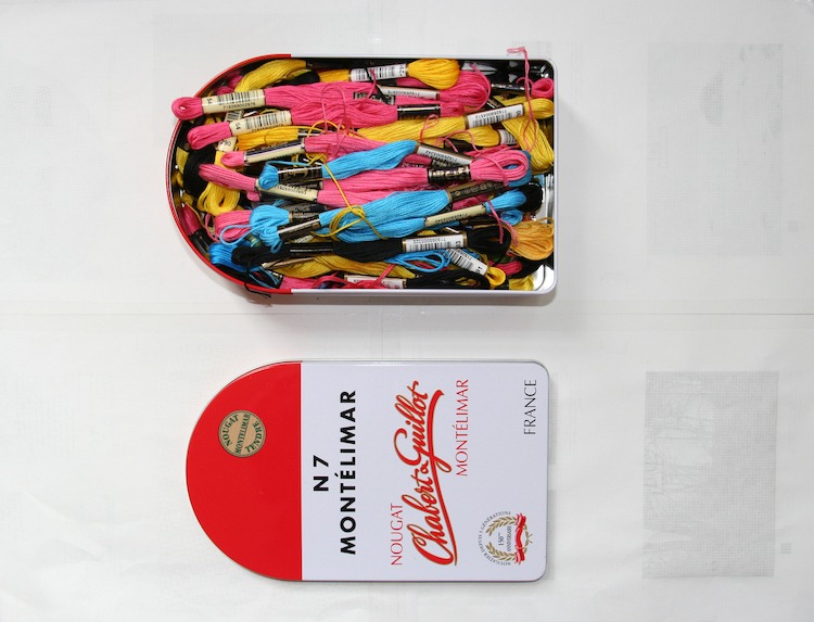
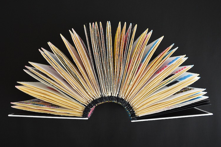
When sourcing paper I was looking for a strong texture that does not break or rip after multiple layers of embroidery. The pages are french folded, so it was also important that paper is not too heavy and does not break on folds.
What equipment did you use in the creation of the piece and how was it used?
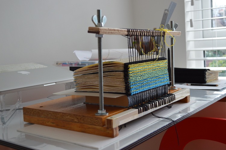
A computer for designing the book, and then just needle and thread for hand embroidery. For binding the book I used book cloth and cardboard, and a self-made book binding frame.
Achieving a seamless flow
Take us through the creation of the piece stage by stage.
I make all my drafts and sketches digitally. The whole book was designed in InDesign.

The next stage was stitching the pages, one by one, layer by layer. It was the most time-consuming part. Pages were mostly stitched on my spare moments at home.
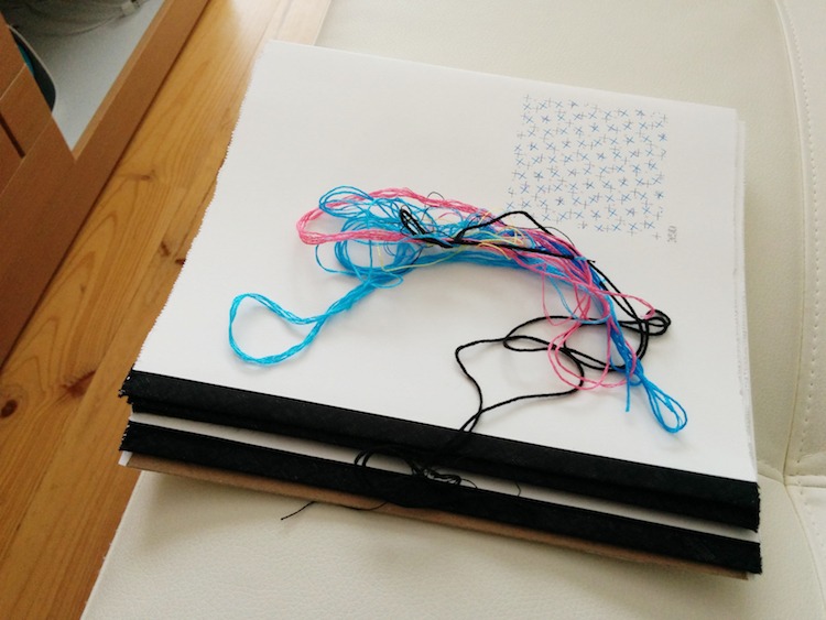
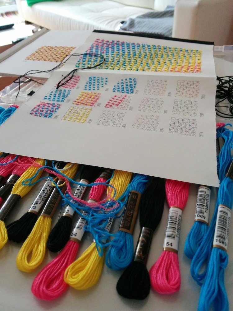
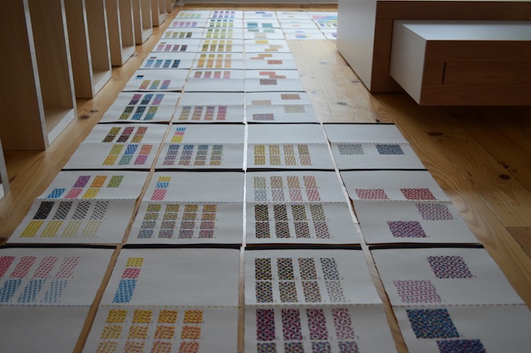
Quite a lot of embroidery was done on my flights between London and Tallinn, much to the amusement of my fellow passengers and stewardesses. Stitched pages took several years to complete. When laid out side by side, book pages filled the entire studio floor!
Then I had to figure out how to bind single sheets. French folded pages have a fold on the outer edge.
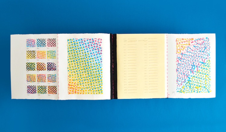
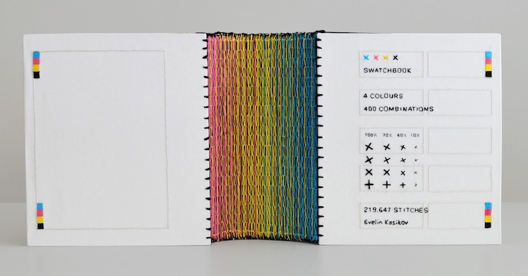
When doing some tests, I found that bias binding used in sewing to cover raw edges also works very well for my book project. After sewing black bias binding strips to all spine edges, I had to figure out how to create gradient fill on bound spine. I wanted it to seamlessly flow from blue to yellow to magenta.
When the binding was complete, I attached covers.
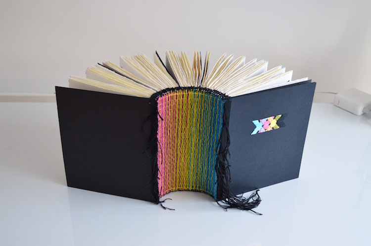
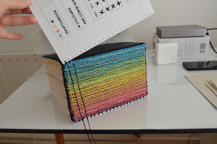
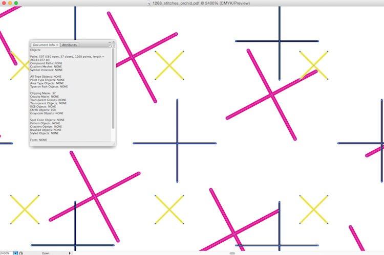
Front and back covers were hand embroidered on book cloth which was then glued on cardboard. Front cover acts like a key to the project, detailing all elements and combinations used in book. It even specifies the exact number of stitches made in book. Because all artwork was designed digitally, it was easy to count the stitches by looking at file info.
What journey has the piece been on since its creation?
The work is so new that it has not been exhibited or featured yet. It is no doubt the biggest personal project I have ever made. The project can be viewed on my website.
For more information visit: www.evelinkasikov.com
If you’ve enjoyed this article why not share it with your friends on Facebook using the button below?

Comments