Linda Colsh is a textile artist producing work of great complexity and beauty, both technically and emotionally. The inspiration for her pieced, layered and stitched artworks is drawn from photographs, drawings and writings. Each work begins with blank white or black cloth, which she alters with dye, discharge and paint. She works with design software to develop her images for printing by digital or traditional methods. Her process is weighted to designing and preparing content and cloth before the actual stitching together.
In our interview with Linda, she shares some fascinating insights into how living in several different countries has influenced her work, and why she works predominantly in black, white and grey. She also offers an in-depth exploration of her choice of subject; the elderly. It is always intriguing to discover how different artists approach their work, but Linda’s process is particularly fascinating. It seems to me she works almost like a novelist would; un-peeling the layers of a subject’s personality until they become a whole new invention – a character. It certainly makes for a most inspiring and educational read.
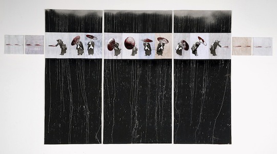
The comfort of cloth
TextileArtist.org: What initially captured your imagination about textile art?
Linda Colsh: I have both practical and aesthetic reasons for working in textile art:
The attraction of soft art. I really like the comfort of cloth, both tactile and visual. The subtle shadows formed by the hills & valleys of the quilted surface; how light is absorbed and reflected by different weaves or the paints, dyes or inks. I go into the wet studio for months at a time to investigate a tool or material to find out the “what ifs” and push to know all the characteristics of some thing I want to use. What happens with more or less of something? What are its edges like? Is it flat or visually textured? What happens working horizontally or working vertically? Or working horizontally and then hanging vertically at some point in the drying? Cloth responds in a unique way.
The need for portability; changing house frequently as a military spouse meant packing up and moving on every couple years. Also, by the late 80s, I was living in Asia, then Europe and to continue to exhibit both where I lived and in the United States, packability for shipping and for those long trans-ocean trips made textiles a good fit: an art quilt will roll or fold to fit a small space for a shipping or storage in small living quarters; fiber art is not fragile so a piece will stand up to handling, knocks & bumps.
The characteristics of textiles present some unique installation and display issues in that they are not rigid or framed, which some viewers do not accept; however, on the positive side, once gallerists or curators work with the 2-point hanging system of laths in a sleeve, installing textile art is straightforward and not fussy or labour intensive.
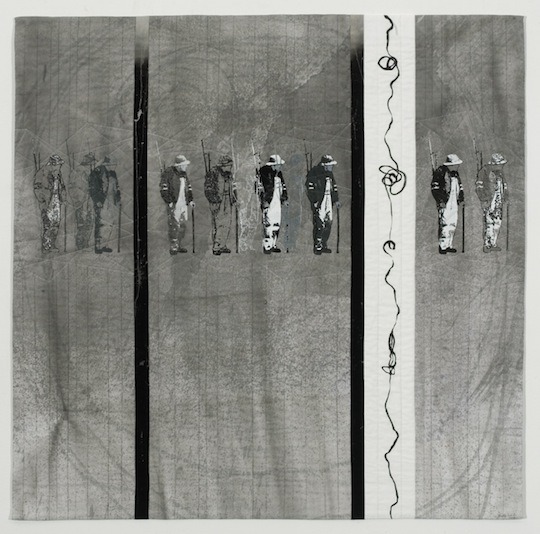
What or who were your early influences and how has your life/upbringing influenced your work ?
My drive to create art – to make marks really – is an inner urge. That I can do it with some degree of proficiency is because of a number of things:
- My paternal grandparents were creative people who let me into their workshop. They taught gently and set the example.
- I have very early memories of crayons on re-purposed window shades and paints and brushes and art-making things.
- My art teachers throughout my schooling were encouraging and exposed me to lots of tools and techniques.
- At university, while I took studio classes to learn by doing, I chose to major in art history to study and learn from masters by opening my eyes, asking questions and observing.
- I’ve lived all over the world in very inspiring places. Certainly, living outside one’s native culture is a strong impetus to see and record. While there inevitably are difficulties in being away from the familiar, that very “otherness” heightens senses and powers of observation. It isn’t enough to simply look; part of being an outsider is to note one’s apartness and the strangeness or fascination of the different surroundings.
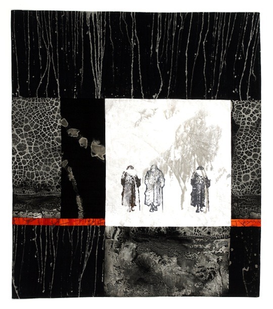
Dye, paint, print, inkwork
What was your route to becoming an artist?
I’ve always made art either on my own or in studio classes. As noted, my university majors (I have bachelors and masters degrees in art history) gave me the knowledge and background to know what others have done – to see how art is made, what makes art successful, to see the evolution of styles and movements.
What is your chosen medium and what are your techniques ?
I am an artist. When asked for the medium, I usually answer fiber art or textiles. However, my process is heavily weighted to the surface design of the fabric that makes up my work: dye, paint, print, inkwork….I use brushes, screens, nontraditional tools…. It’s the conundrum of the word “medium” – is it the techniques the artist uses? or the materials the artist works with? Add to surface design, the sewing and quilting, and the list of processes and tools expands even further. That is why the most accurate word for what I do is simply “art.”
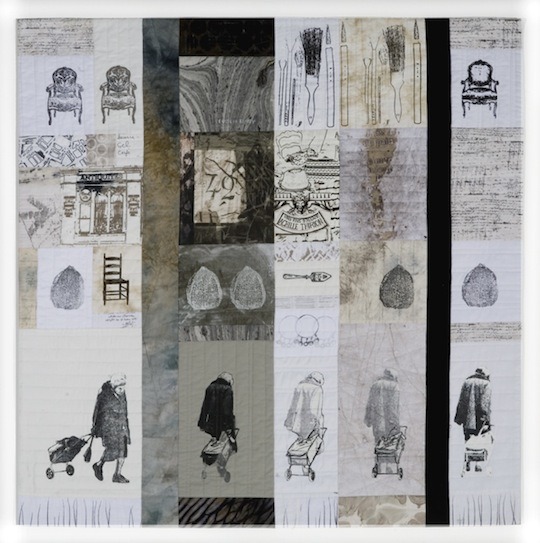
The acceptance of fiber art
How would you describe your work and where do you think it fits within the sphere of contemporary art?
My work is surface-designed, layered and stitched. The baggage of working in a traditionally women’s medium sometimes weighs heavily on the art world’s acceptance of what I (we) do. During my 6 years on the Board of Studio Art Quilt Associates, my focus was on keeping lines of communication open with the wider art world, educating the public about art quilts and fostering the acceptance of fiber as art. I took a lead role in rewriting SAQA’s definition of “art quilt” to make the art form more inclusive. I look for places to exhibit my work in art venues where the audience might be introduced to the qualities of layered, stitched artwork.
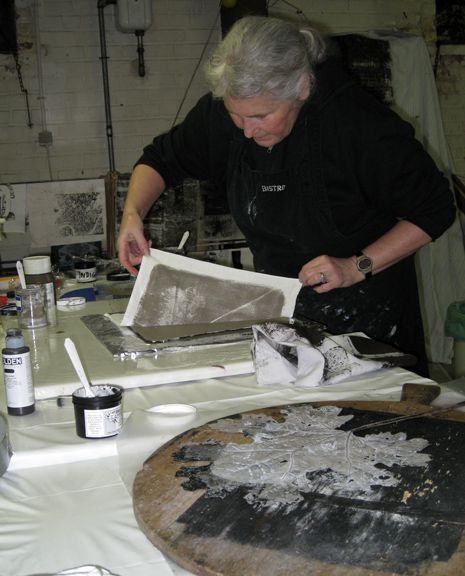
Tell us a bit about your process and what environment you like to work in?
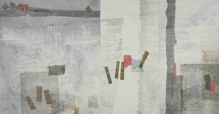
My process is layers of printing, painting, discharge and/or dye work on plain white or black fabric. I work from my photographs, altering them on the computer to make thermal imager screens from positives, negatives and line drawings. The fabrics I make with these surface design processes are pieced and quilted on my home sewing machine.
I have two dedicated studio spaces at home, plus the computer room. I have a sewing studio and a large wet studio. I supplement the inside studios with outdoor work when weather permits. Because I have worked with the same techniques for a long time, I have learned how important ambient conditions and weather are to the surface design processes involved in making my artwork.
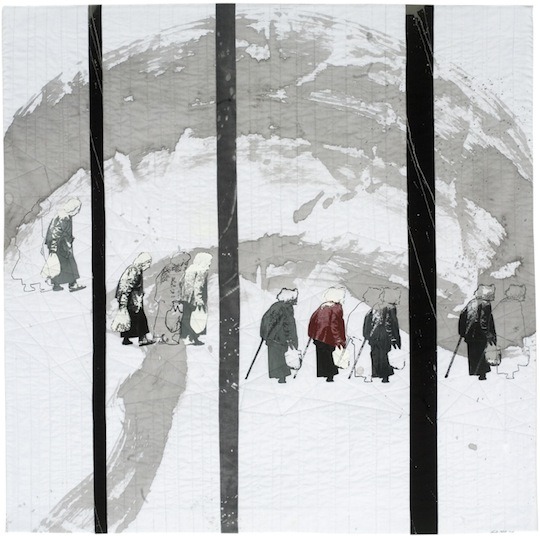
I make the most of conditions by working in concentrated periods outdoors or in the studio, depending on conditions. Warm sunny days are when I dye, discharge or paint. My large-scale calligraphic strokework and drip effects require fast dry time to hold fine lines & crisp edges.
Most of the year, however, I work inside. I print the figures and other screenprinted imagery when it is cooler and rainy or humid. I take advantage of the damp chill of my basement studio: drying times are extended, permitting visual effects like back- and ghost-printing when working with acrylic paints. When layering screenprints, the slow drying time allows interesting color mixing as the additional pulls are laid on.
The importance of ‘workbooks‘
Do you use a sketchbook?
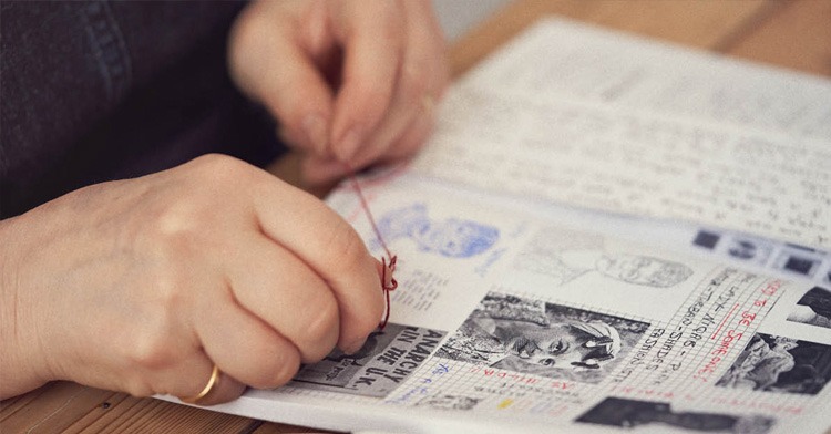
I use a variety of workbooks; many are simply collections of images or notes about things that I find inspiring or want to just not forget. These are very non-linear recordings of all sorts of things, not just ideas or thoughts about things. Photos, postcards, clippings and ephemera, my sketches, writing and drawings, quick collages.
My workbooks are also a way to keep hands and mind active in downtimes, time when I am not actually involved in the making of an artwork. These workbooks are the place where I begin, where I try out, flesh out, modify and even abandon when things don’t come together; a place where I don’t have to finish; or a place that provides the point of going into the studio. Some things do get lost, especially in the older workbooks, but ideas stand a greater chance of being lost for good if they aren’t noted in image or writing at all. I need to take more time to read the old workbooks to rekindle.
I have workbooks where I record words or phrases; I think of these as my “titles workbooks” because the words & phrases sometimes percolate to become the titles of my artworks. I really care that my titles are part of my artworks – kind of like finishing the edges of a piece or applying the hanging sleeves or stitching the label on the back. So, I spend time to think about the title and make it illuminating. Sometimes, a piece will have a title before the work is even begun; other times, the title isn’t settled until the last moment.
Also, I have my technical workbooks. These are full of rather dry pages of the puzzle-working of numbers, calculations and rough lines, squares and rectangles that are my construction diagrams for piecing – the patchworking. I have a master construction workbook that records the size-numbers I need to work to for the various formats I work to.
A number of years ago, I decided to work to some standard sizes & shapes for presentation reasons (1-meter & 1-1/2 meter squares; tall, narrow rectangles and less strictly sized horizontal rectangles; & some small format work, which are the bread and butter sizes). To work this way requires more planning and repeatable planning (pieces don’t just grow to whatever they become); thus, the master construction workbook.
My palette
Why do you work in black, white and grey?
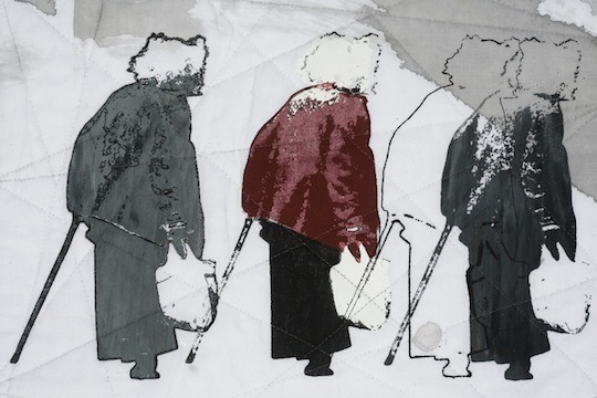
While grey for the elderly seems an obvious choice, design is the reason I choose a neutral palette. I want to have the full value range from deepest dark to lightest white when I am designing and composing a piece. Black-gray-white provides the greatest range and I can almost get that range with a brown palette.
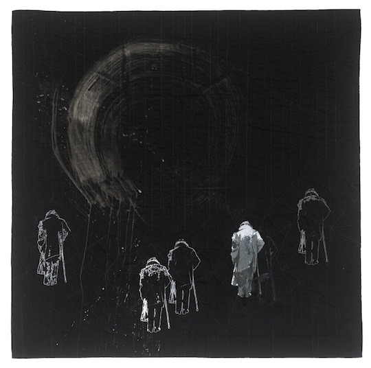
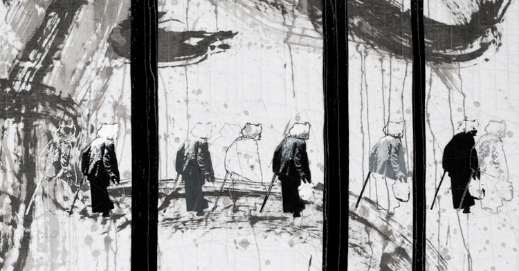
I find a colored (hued) palette has limitations, so when I use color, it is for emphasis and accent, as in Red and Brittle Silence or the pinks in Almost There.I think of color as a sort of jewellery – something sparkly and rich to adorn my basic neutral working palette, but not essential. Yet, because I mix almost all of my grays, blacks, and browns from primary colors, my palette is always made up of pushed neutrals with over or undertones of other hues. In addition, there is great drama to be had when running the complete value range from white to black. A neutral palette can be either powerful or loaded with subtlety.
Why have you chosen the elderly as your subject?
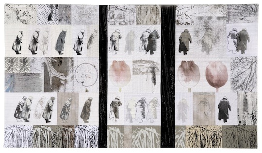
The wisdom and experience of a lifetime reflect in the posture, face, hands, hair and expressions of an older person. Character is no longer hidden. To me, there’s an honesty and openness that grows with age. It is a different kind of beauty, more along the lines of wabi-sabi; not prescribed, but found by those who take time to look. The elderly tell stories – literally and through their images and my content is narrative-based. I look for stories in older people because, to me, they are endlessly fascinating. I find more individuality, more depth and certainly more of interest in the elderly. I like to look where other people might not look to find a good story.
I don’t know the person I portray in most cases. With this anonymity, I can write my own stories into the image, working from little things I pick up based on what I see and what I imagine. I spend a long time with my workbook pages and computer images of each person developing my narrative for each character.
The terminology I use in talking about my subjects is indicative: I speak of taking a photo of an older person, working with her or his image and and developing and printing her or his character. My word choices to describe this evolution are significant; I start with a real person, but by the time she or he is in my art, she or he is a character.
Heavily dependent on narrative
Is content important to your work?
Indeed. My art is heavily dependent on narrative for content. My character development involves not only working with images in Photoshop.
var uri = ‘https://impgb.tradedoubler.com/imp?type(inv)g(22851164)a(2813327)’ + new String (Math.random()).substring (2, 11);
document.write(‘‘);
But at the same time, I am writing in my workbook about the character. Until recently, I let a lot of a character’s story be carried by supplementary imagery that functions as props to move the story.
My newest work relies on the character’s image to implicitly tell the story. I contrast the scale of the printed character with large scale, calligraphic-like strokes such as in Red. This vast scale difference conveys the notion of the elderly trying to cope with old age and a society that prefers to ignore them.
Has living in Europe (or in places distant from your native culture) influenced your art?
I live in a place that is often gray. Belgium’s weather is often rainy. The sky is often white or gray. In winter, frost, fog and mist is frequent; the sun is low and the light silvery; dark comes early. The colors here probably influence the neutral palette I use and it will be interesting to see if that will change when I move to a new environment in the US.
Through my art and teaching and my husband’s work, I’ve been extremely fortunate to have had many travel opportunities: we’ve lived on both coasts of the US, in Korea and here in Belgium and have traveled throughout America, Asia and Europe. My years in Asia really transformed how I look at people and things. I believe that living in a place that is foreign provides a strong impetus to observe and record one’s impressions. Each place I have lived deeply changed my art and me: sometimes in technical ways, such as studying oriental calligraphy in Korea; and other times, through direct observation of and response to my surroundings.
For more information about Linda Colsh visit LindaColsh.com
Part two of our interview with Linda is coming soon. In the meantime why not tell us your thoughts on Linda’s incredible work in the comments below?
Comments