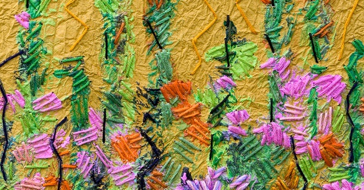
Mary Beth Schwartzenberger intends to make a scene. Literally. She loves filling blank walls with what she calls ‘roomscapes’ that transform rooms and transport viewers. These large paintings are covered with thousands of stitches – the result is a mixed media experience that sets her apart in the textile art world.
Mary Beth became interested in creating art for the home and workspaces while working at an art framing shop. As she interacted with a variety of interior designers, Mary Beth soon recognised the power of art to establish a mood as soon as one entered a room. And the bigger the art, the bigger the impact.
Be assured, the same phenomenon happens when Mary Beth exhibits her work in traditional galleries. Enhanced lighting causes colours and textures to pulse, and she particularly enjoys people’s surprise when they discover the thousands of stitches that make her work sing.
Mary Beth’s favourite subject is the natural world, especially her beloved Yosemite National Park in California, USA. But she is also inspired by artists like Monet and Matisse who were masters at colour blending and combining abstract shapes into cohesive wholes.
In addition to paint and stitch, Mary Beth uses a unique Japanese paper she discovered while searching for materials for a school arts and crafts activity. Little did she know that this paper would launch an entirely new creative adventure.
Literally and figuratively, Mary Beth is making a big deal out of paint, paper and stitch. And that’s a very good thing.


It started with a bulletin board
Mary Beth Schwartzenberger: One of my aunts was a milliner and expert appliqué quilt stitcher, and a cousin of mine created punch needle wall art in the 1960s. Both of those women opened my eyes to using textiles as art.
Later during high school, I created artwork for my homeroom’s bulletin board. I remember being shocked at my luck in being chosen for that task, and I couldn’t imagine why no one else was as keen as I was about the opportunity. For my first photo collage, I cut out felt letters to make The Beatles song title All You Need Is Love. And, for the first time, I acknowledged my creative nature.
“Nothing excited me like creating art, so I continued to explore and find my voice.”
I went on to art school at Columbia College Chicago and started as a photography major. I loved the subject but not the students in the programme. Nearly all were men who were uninterested in sharing anything. They coveted everything they did, including locations and their processing skills in the darkroom.
One day, I happened upon a room full of big contraptions that intrigued me to no end. They were floor looms! I immediately knew I had to learn how to weave and, from that moment on, I was a fibre artist.
Columbia College was all about teaching practical skills for working artists, so I apprenticed at a local weaving shop my final year. I taught classes, learned the details of running a business and gained experience in curating and promoting textile exhibits.
After college, I moved to Los Angeles with my husband. One of the first places I visited was a weaving shop where I met some talented women who were interested in forming a supportive fibre community. They’ve become lifelong friends. I started focusing on wearables and grew my merchandising from park shows to the American Craft Council’s wholesale and retail shows for several years in Baltimore, Minneapolis and San Francisco.


Framing matters
After my daughter was born, I transitioned into paper making, collage and monoprint. I experimented with as many techniques as possible.
The first work to which I added stitching was a monoprint, and the way it brought the print to life was very exciting. I also added collage elements and began to develop my own artistic voice. I was searching for a way to have my art stand apart, and fibre was my route.
Then when my daughter started school, I began working as a designer at a local art frame store. Dealing with such a wide variety of creative talent was educational – it trained my eye to distinguish between average and truly exceptional work. Also, as an artist who frames her own work, I was also able to learn about the process, materials and costs involved in various presentations. I always tell artists to get to know their local independent framers and learn from them. They will save themselves some expensive mistakes.
“For me, framing is like icing on a cake: it’s meant to enhance one’s work rather than overpower it.”
The magic of ‘roomscapes’
Art has the power to transform interiors and can enliven any room. From intimate home spaces to sweeping corporate settings, I seek to create art that helps bring a room’s interior to life. When working with interiors in mind, it’s important to stay aware of colour preferences. Interior colours change just as they do in fashion.
“I enjoy viewers’ surprise when they realise my work is embroidery on paint. It’s an entirely new concept that draws them in.”
I’ve learned that designers representing higher-financed clients tend to select works from established galleries, as a gallery’s reputation can be as important as the artwork. And designers working with large corporate installations are often required to choose artists known to the architectural firms contracted for the job. So, all of my opportunities have come through local designers, and I’ve had my framed work displayed at the Los Angeles Pacific Design Center where designers and their clients can purchase art off the wall.
I have also been fortunate to have had pieces included in retail interior design showrooms as well as ‘design houses’ in which every room is redesigned by an interior designer. These events are often fundraisers for local nonprofit organisations.
Despite these opportunities, marketing continues to be my greatest challenge as an artist. I’m always looking for ways to connect with designers. I remind myself that I know my craft, and I have confidence my work is unique and deserves attention. But it takes perseverance and tough skin.


Kyoseishi love
I hosted an after-school craft programme when my daughter was in primary school, and one of our projects was an accordion book. I had been playing with various ways to cover books, and I stumbled across kyoseishi paper at an art supply store. I loved its crinkled surface and suppleness.
I played with ways to decorate the paper using stamping, painting and attaching beads. I also discovered the paper was easy to glue to book cover boards. It laid smooth as butter and folded over the corners so neatly. So, I went back to the store and bought all they had in stock, and then they never reordered it!
I knew the paper was Japanese, so after some sleuthing, I was thrilled to find a Japanese paper store in Los Angeles who represented the Awagami Factory. Awagami’s kyoseishi paper has strong integrity that holds up when wet from painting and can handle machine stitching.
Kyoseishi means ‘strengthened paper.’ It’s covered with konnyaku, a form of starch derived from the Konjac or ‘Devil’s Tongue’ plant. When the starch is mixed with water, it forms a thick liquid that’s brushed onto the paper to give it strength. But it’s still flexible enough to withstand the crumpling and kneading that gives the paper its wrinkled cloth-like texture.
Working with this special paper has been a self-taught journey, and I’m still learning ways to apply paint to the surface to achieve various looks.


Creative process
All my art is created intuitively. Ideas and images present themselves to me. Sometimes I just start painting on a piece of paper and let the colours remind me of something and go from there. Other times I refer to other artists’ work for inspiration either in theme or setting. I’ve collected some wonderful books by various artists that I often explore. I’ve also participated in many workshops over the years, but most of my self-development has been through pure experimentation.
First, I decide what size piece I will be creating. I’ll run a wet brush down a marked line, and then tear the paper along the edge of a ruler. This leaves a soft and irregular torn edge, perfect for float framing.
Painting the paper may take one or more sessions, depending upon how many layers of colour I’m seeking. I use a variety of paint brushes and acrylic paints, adding a fusible support layer to the back before stitching. This helps me anchor my thread and provides a bit of stability to the paper.
When stitching, I tend to work in sections either from top to bottom, or side to side. The type of stitch I choose depends upon whether I want an area to be prominent or to recede into the background.
“The purpose of my stitching is to always highlight a painting, not conceal it.”
I use very simple stitches: straight stitch, seeding and french knots. I usually have a big surface to fill, so it would be too time consuming to get deeper in the weeds on stitch styles. I also primarily use DMC six-strand stranded embroidery floss. I have used some beautiful silk threads but, to be honest, their beauty is lost in a large work.
I do enjoy stitching french knots because they’re so versatile in structure and dimension. In Room With a View, I used a thicker cotton to give the curtain edge a playful feel. At the time, I was exploring the themes and perspectives used by Matisse. Windows were a big concept of his, and this room from my imagination is a nod to that. I wanted to combine different patterns, and the heavily patterned curtains and interior wall frame serve as a contrast to the calmness of the ocean.
On occasion, I’ve painted threads after they are stitched, but I don’t like how the paint makes the threads stiff and harsh. I instead prefer stitching with multiple strands of different colours in one needle to enhance colour blending. Fortunately, when I paint the kyoseishi paper, it still remains flexible and clothlike which makes for easier stitching.
Another important part of my process is keeping a notebook, where I enter my start and finish times every day I work, as well as a listing of the colours I’ve used.


Yosemite calls
My beloved Yosemite National Park is the most beautiful place in the world! I first visited in 1976, and I’ve tried to go every year since. When I’m in the Yosemite Valley, I’m surrounded by such majesty: imposing granite walls, waterfalls, quiet streams and more.
Every season is seductive. Pounding rain can quickly turn into the quiet of falling snow. Waterfalls become rushing and powerful in the spring. Rivers are refreshingly cool on a hot summer day. And in autumn, the colours can fill a painter’s palette. All these experiences provide endless inspiration for my work.
Viewpoint was created in response to Yosemite’s beauty, and it’s one piece I will never sell. I wanted to create visual excitement by having a wide vista that travelled uninterrupted onto each panel. Each panel of the triptych is 64cm x 90cm (25″ x 35″) and when installed it’s very wide. I really enjoyed playing with the subtle colour variations in the sky. All the stitches are groups of three straight stitches in varying angles to each other. When it was first installed at the Oceanside Museum of Art, I was pleasantly surprised to discover the various angled groups of threads captured the lights in unique ways, creating varying highlighting effects.
“I estimated that Viewpoint includes over 10,000 stitches. It was the last piece my mom saw before she passed away, so for me, it’s a testament to the ability to create beauty out of sadness.”

Working in black and white
In 2016, I entered First Snow at the annual Yosemite Renaissance exhibit. It’s a year-long travelling show that begins in the gallery at Yosemite National Park. At the time, California was experiencing a multi-year drought. On our trips to Yosemite, we saw so many logging trucks coming down the mountain piled high with huge pine trees damaged by the drought and then killed by a bark beetle. It was estimated California lost more than a million old-growth trees during that drought.
I wanted to place a dead pine in the centre of the work and then use french knots to represent the healing blanket of snow that would soon cover the forest. I chose to only use black, white and a few shades of grey, as I thought using colour would lessen the impact of the image. It was a challenge to make the scene have dimension and perspective with such a limited palette, but I think the few shades of grey helped.
Wish Flower was created for an artist showcase gallery in a local Williams Sonoma Home store. Knowing the design trend at the time featured a lot of linear black, white and grey, I made a few pieces along those lines. The background was painted with a silver metallic paint that I rubbed into the kyoseishi paper to provide a soft background for the stark image. I painted the flower and then stitched onto the painted lines using couching and french knots.


Embracing the mess
Ebb and Flow was created for a 2011 show at the Metro Water District offices in San Francisco. It’s an earlier work in which I combined collage techniques and materials with my early explorations painting on kyoseishi paper. I added torn strips of dupioni silk which is a fantastic material. When it’s torn, you can pull the weft out from the edges to create dimension.
“There is something so appealing to me about messy fibres. They just seem more organic.”
I machine stitched the fabric strips onto the painted paper in random patterns, letting the loose threads hang off the sides. Like the kyoseishi paper, I was also able to pucker the Dupioni silk to form peaks that held their dimension.
Since the work was to be shown at a water district office, I folded the paper in soft accordion curves to mimic the ebb and flow of water. The multi-thread french knot was an additional way to add dimension. I’m not particularly interested in perfect french knots – I prefer a more imperfect, loose effect.


Moving on up
When I first started creating, I worked on top of the washing machine in my laundry room. From there I graduated to the kitchen counter, and then when I started working on larger pieces, the kitchen floor.
When my mom could no longer live alone, she moved into my home. We needed to build storage space, so we added a room on the back of the garage. It turned out so well I told my husband it was going to be my studio and we’d need to buy a separate storage unit! I love being in my studio, and I go in there just about every day. It opens out to my garden, which has inspired many of my artworks.
Photo finish
I began stitching on photos a couple years ago. I take photos on my iPhone, and the immediacy is intoxicating. For me, printed photos are like nice, flat monoprints – so, of course, I started stitching on them.
I photograph flowers in my garden or things I see when out and about. I’m learning what type of flowers work for my style, and I spend time manipulating them on my phone or laptop. I print many of my photos at home on Epson Somerset Velvet art paper. I’ve also had larger images printed by a local framer who produces giclee prints.
“When I start stitching on the photos, I’m focused on using the threads to highlight the design lines of a flower.”
I don’t want the stitching to overtake an image, nor just portray a flower. I want the stitch work to convey a strong emotional pull, create a mood or conjure a feeling or memory.
Sometimes I’ll make holes in the photo with my needle first, but other times I just start stitching. I don’t use thick fibres or chunky needles. And if the white backing shows where the needle comes up, I just gently push it back down with the needle or a pen or pencil in a matching colour.
I’ve just begun experimenting with translating one of my stitched photos into a painted form on kyoseishi paper. I still have a lot to learn with applying stitch to painted images and photographs. I’m excited at the results so far and will be exploring this more.



Comments